This is a collective research project providing examples and discussion of the basic building blocks of visual data representation.
Chernoff Faces
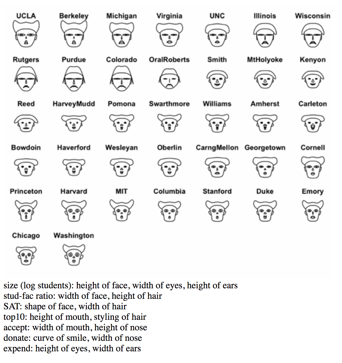
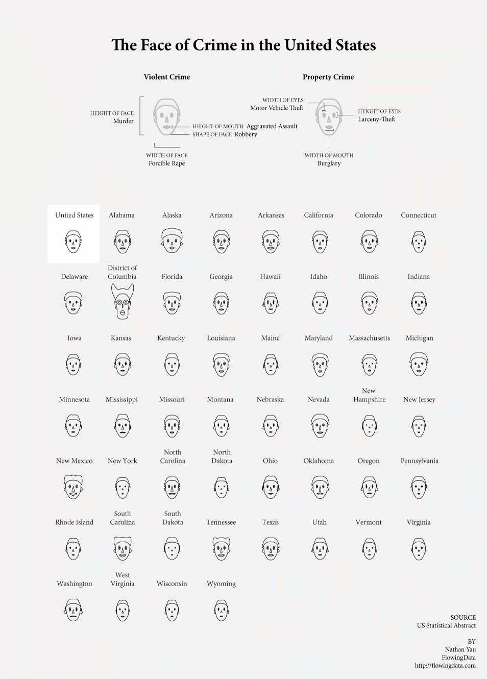
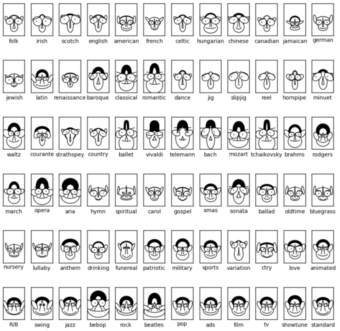
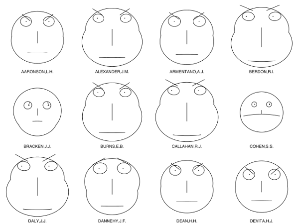
Chernoff Faces are a method for diagramming multiple variables of data at once through facial features (eyes, nose, hair, ears, mouth, eyebrows) with size, orientation, shape, color, and placement potentially representing different attributes of a single observation based on numeric values in a data set.
Our visual system is tuned to understand and remember human faces, so we are able to notice small differences and similarities within the data. However, for the same reason, this may lead to misinterpretation of data (especially without a key) as we have strong and varied personal associations with certain facial features.
An algorithm is used to translate the categories of raw data into a specific feature on the human face.
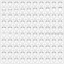
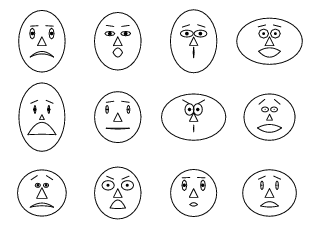
Examples:
The addition of a key is imperative and helpful to be able to interpret the data.
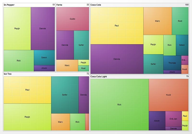
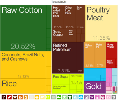
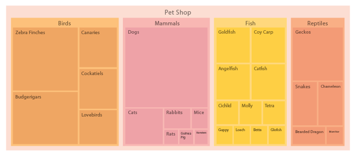
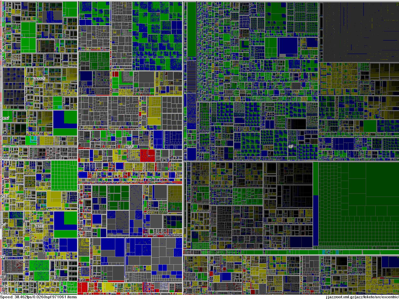
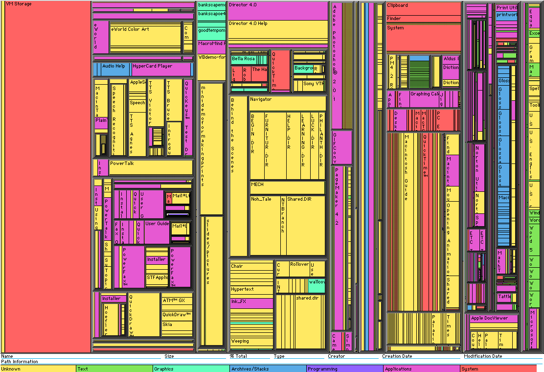
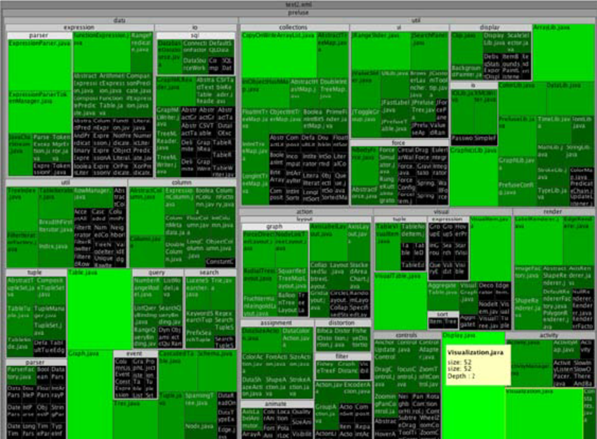
Tree Maps
This visualization type distinguishes different sectors in the stock market using two-dimensional boxes (rectangles) within boxes where the size of the box determines the size of the sectors and the largest stocks in the market. The boxes are a quantitative representation of the stocks in the market and thus this graphic enables a quantitative comparison but not necessarily a qualitative one.
The area or size of the rectangles clearly define the data in terms of proportions or percentages. The fact that the this form of mapping uses "nested rectangles" in hierarchical order wherein these boxes are within one another enables one to see the subcategories of data in their respective quantitative representation while still being able to see the whole within which they lie.
In order to effectively use tree maps for data visualization, pre-processing of the given data would be necessary and this could include categorization of the data based on some criteria for division and finding sub-categories within the same. It would also be helpful to understand similarities within these different categories so that may be represented by colors or the sizes of the rectangles.
The mapping uses rectangles to represent groups of similar data or categories within the data referred to as branches and subcategories that are represented by smaller rectangles within the larger ones. Colors are then assigned to rectangles based on the quantitative variables associated with the respective data.
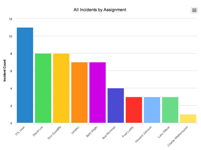
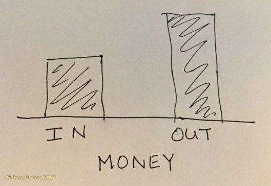
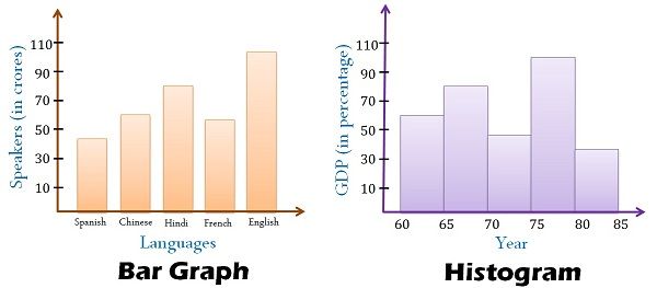
Bar Graph
DEFINITION
Bar graph is the easiest way to present the data. A graph showing the table as a bar. Bar charts can easily compare the number of each figures and show a more accurate number than other graphs. Therefore, Bar graph is an effective way to compare items between different groups. However, there is the downside that you cannot predict the small changes of figures.
Bar graphs consist of two axes. On a vertical bar graph, as shown above, the horizontal axis shows the data categories.
EXAMPLE
Good Bar Graph
Bad Bar Graph
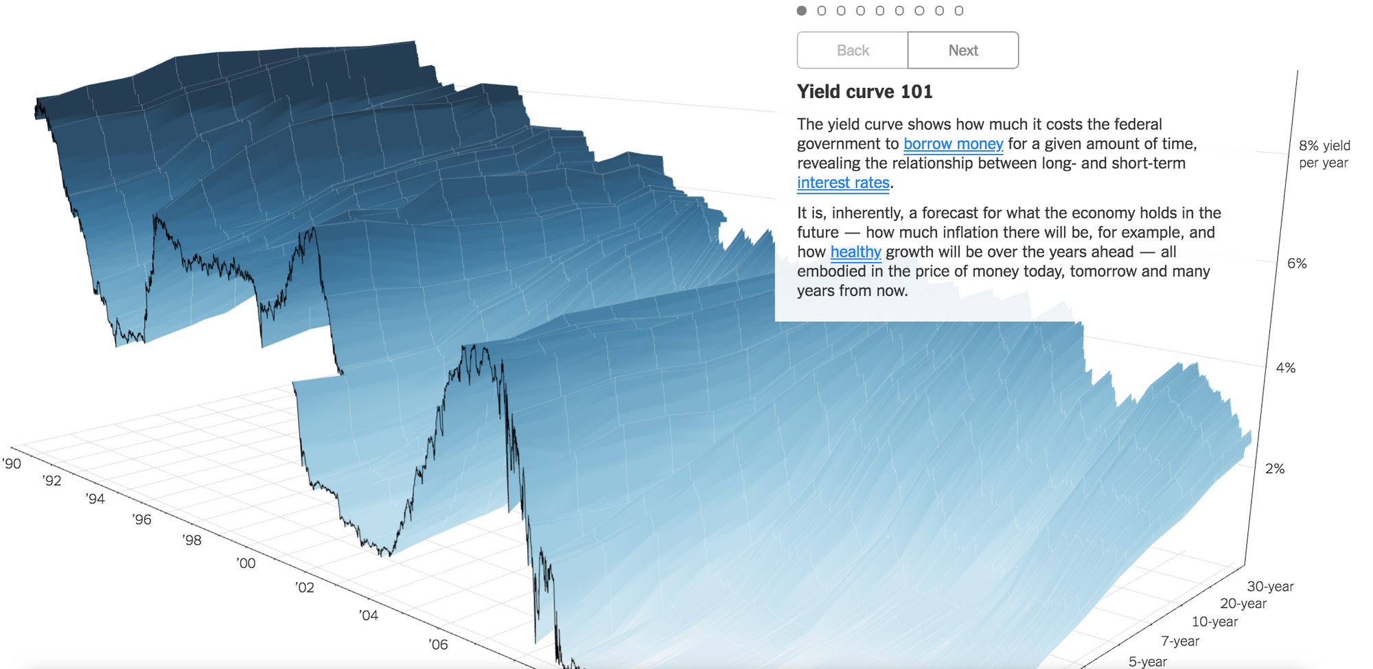
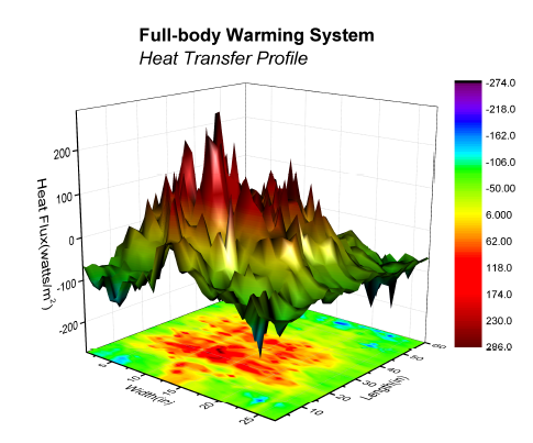
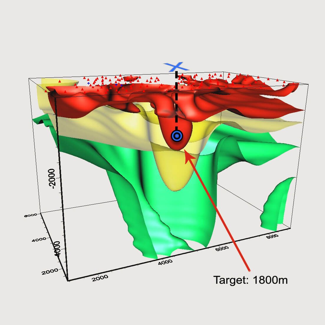
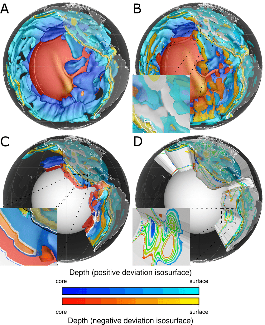
Rubber sheet, Isosurfaces
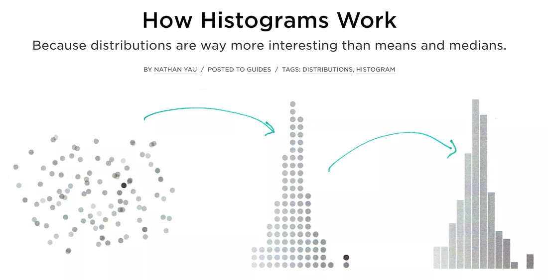
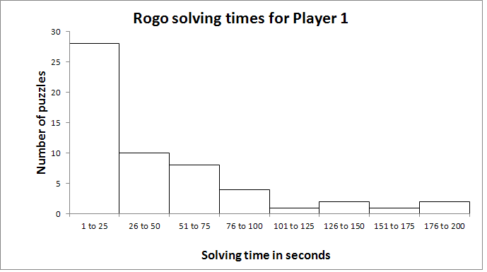
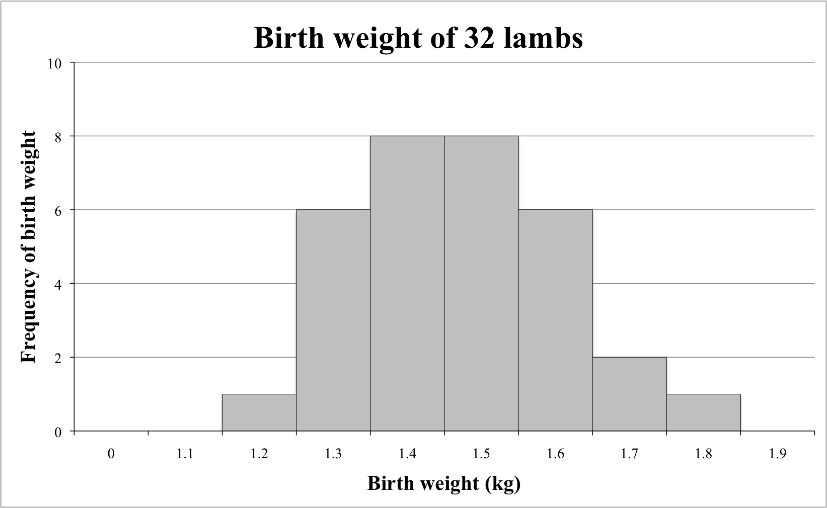
Histogram
The word histogram is said to come from the name 'Historical Diagram' deriving from 1891.
A type of bar chart, the histogram, quickly lets you see the shape and distribution of a given set of continuous data. The values Histograms typically represent are integers.
Unlike a standard bar chart, that has categories i.e. languages, histograms usually chart just one continuous variable along the x-axis such as years or ages.
A histogram uses area of a bar of the (width x height) - the main retinal variable used to depict data in a histogram would be the size of each column. Whereas a bar graphs have equal width between columns and use height only as a visual cue.
Yet orientation, value, color hue, position, and shape all can come into play for the creation of a histogram.
Simple steps to construct a histogram
- Identify your data and what you are trying to visualize for example a given set of ages:
36 25 38 46 55 68 72 55 36 38
67 45 22 48 91 46 52 61 58 55
2. The list above shows twenty different ages with not much relational sense to them. However if we create ranges or "bins" to sort the ages in 10 year intervals we can begin to map their frequency
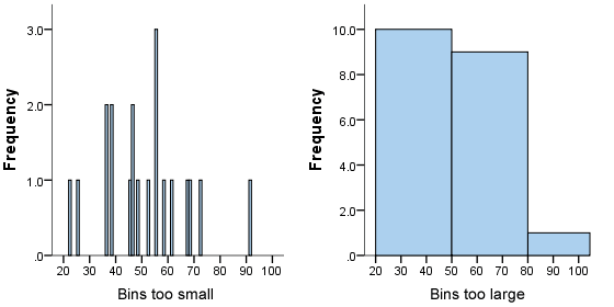
It is important that your bins are not too small or too large. The bins on the X-axis now allow you to chart the frequency for which they occur on the Y-axis.
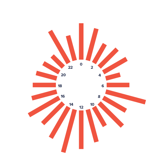
Histograms can also orient their timeline along a spiral or circular shape which allows to compare cycles while keeping a continuous timeline.
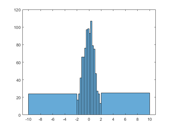
+ examples :)
- examples :(
Parallel Coordinates and Star Plots

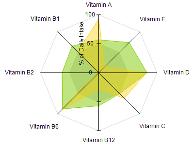
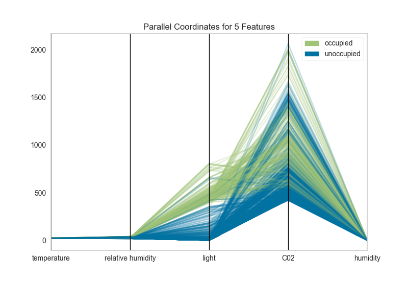
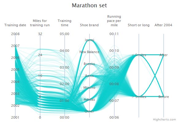
Parallel Coordinates are generally used to show the differences between the dimensions of one thing. Dimensions are not strictly based on the length of a shape, like the comparing a the length of a person's feet to the length of their hands to the person's height.
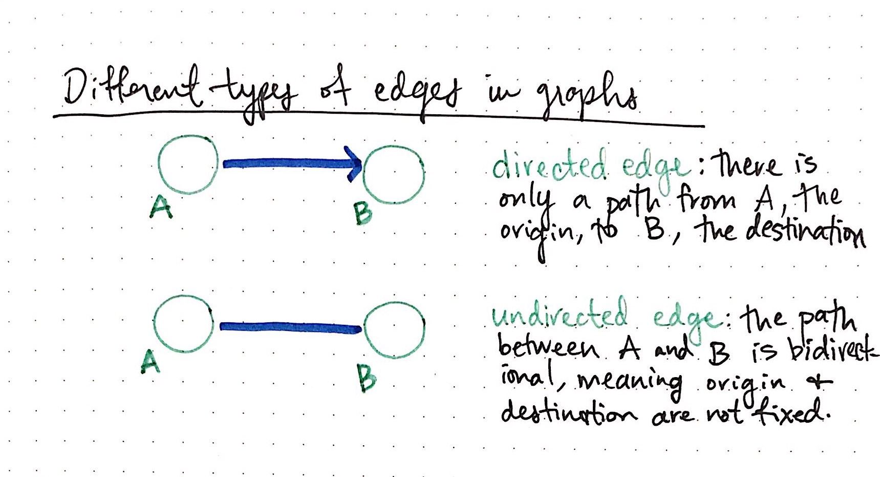
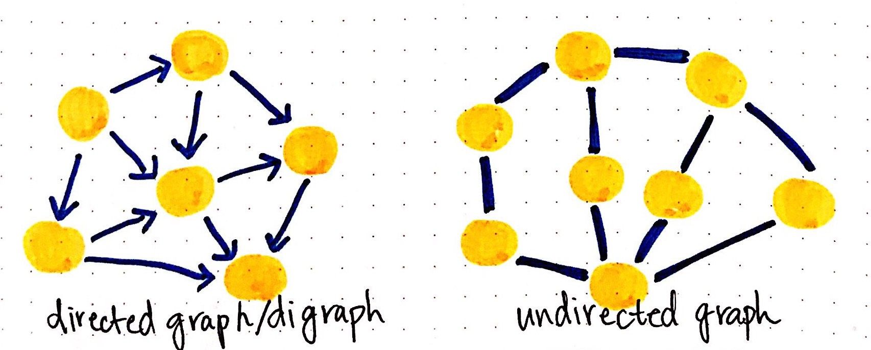
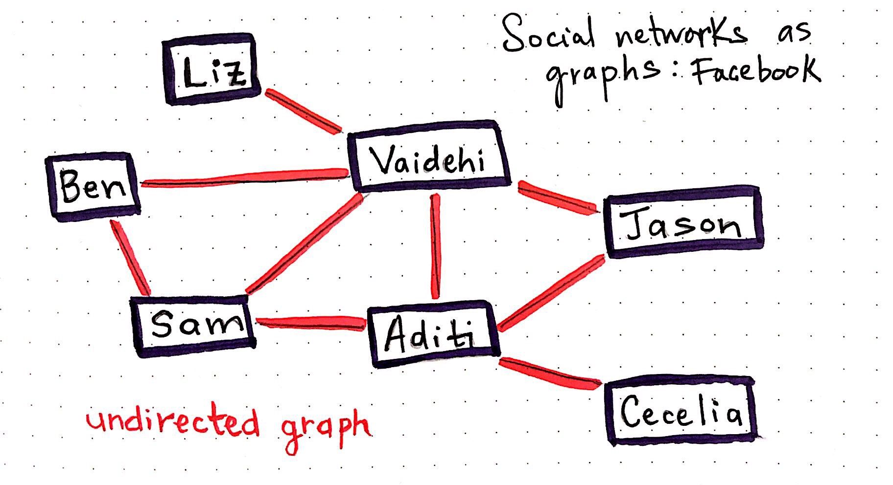
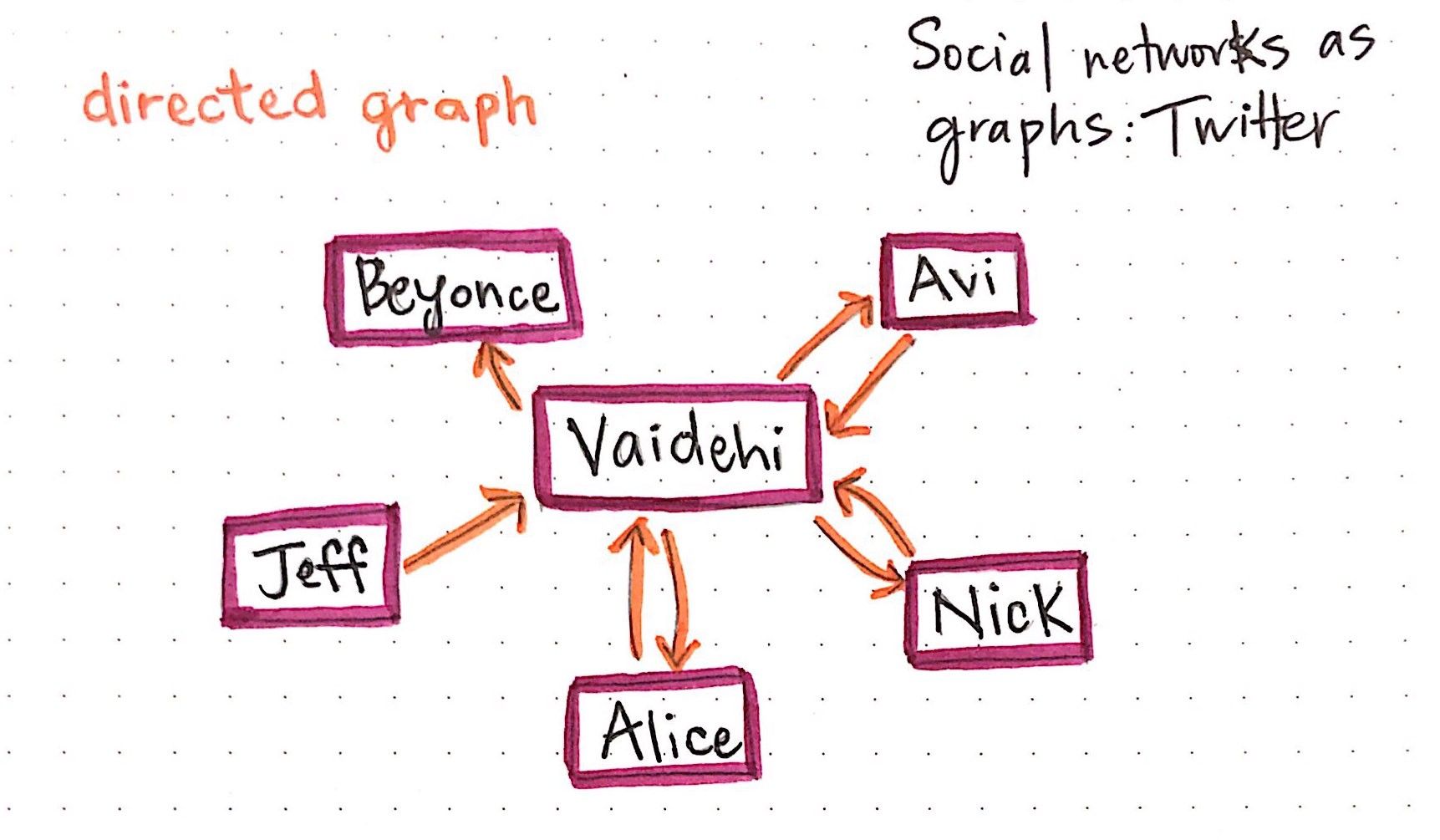
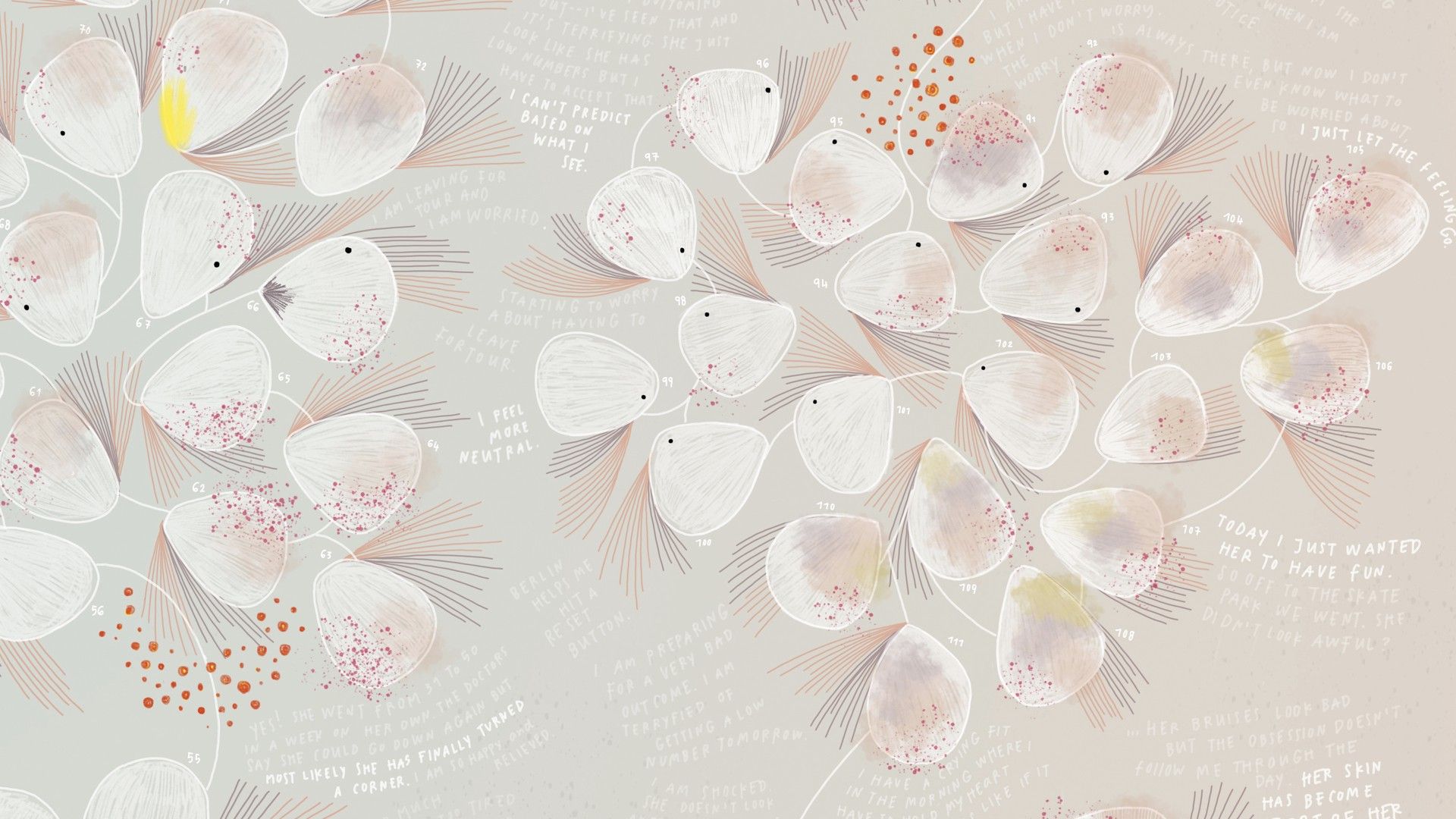
Trees & Graphs
Trees are nothing more than restricted types of graphs, just with many more rules to follow. A tree will always be a graph, but not all graphs will be trees.
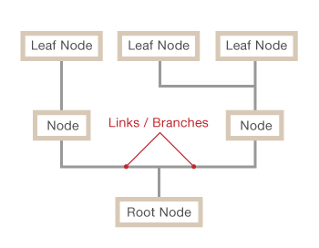
A tree diagram or graph is best used for a sequence of events - it's hierarchical and shows the relationships between whatever value is inputted. It's often used with fractions to show probability.
'Position' is a key visual variable in a tree diagram, less so in a graph, as every value's position relative to another is what represents the hierarchy. In a graph, values can basically be anywhere so long as they're visually connected in another way.
Other visual variables can be used to show classifications / groupings within the overall structure, how connected values otherwise differ.
As far as pre-processing, there doesn't seem to be any specific methods needed for trees & graphs so long as the data can be appropriately analyzed (if labels instead of purely numerical) and the data is categorized.
'Good' Examples
'Bad' Examples

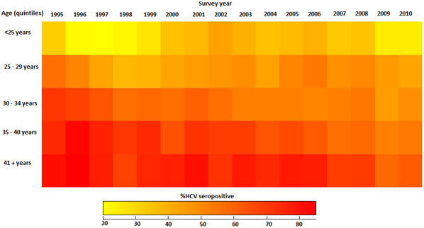
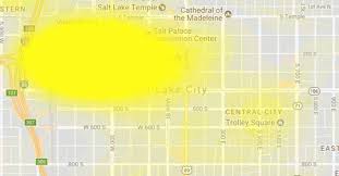
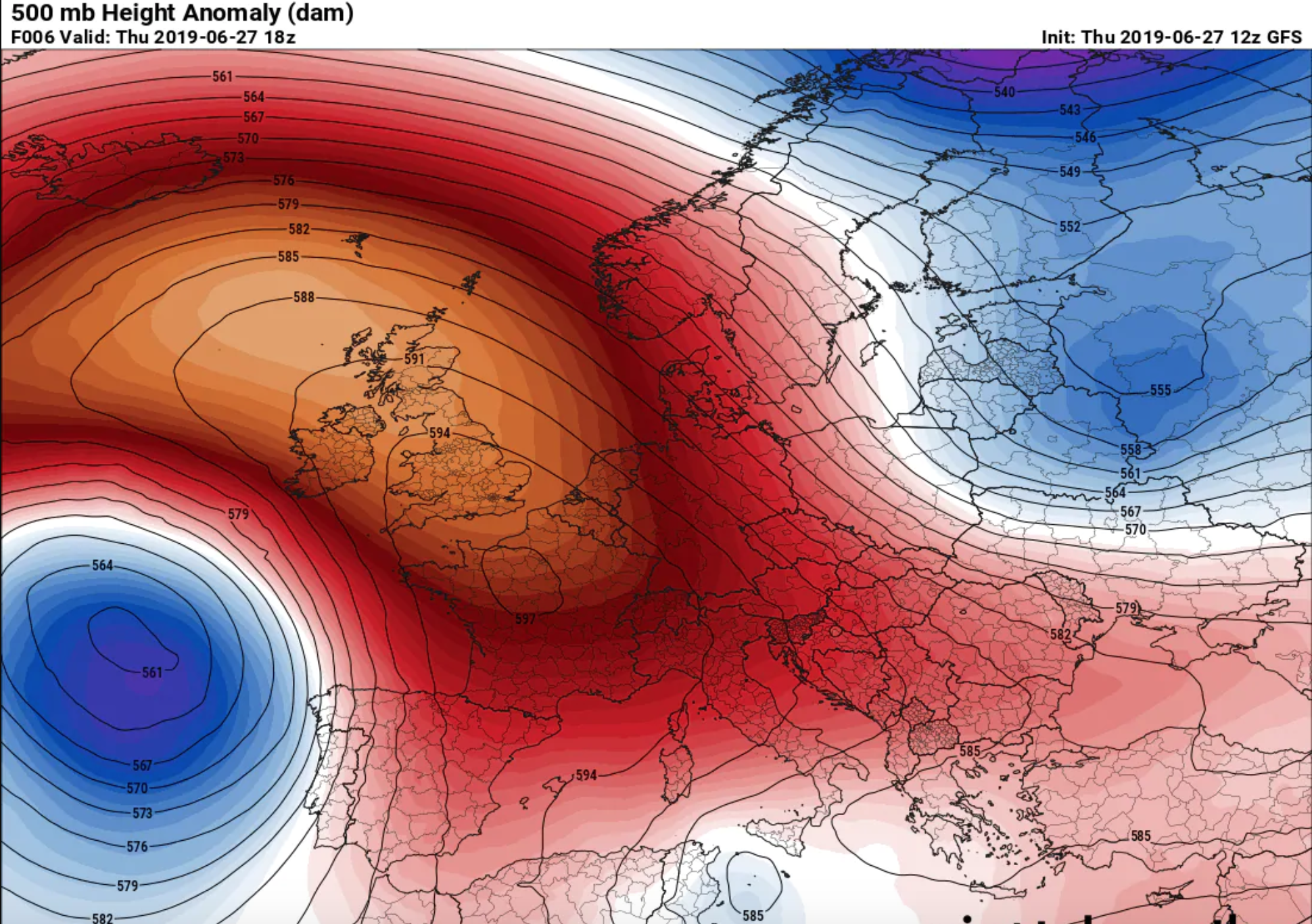
Heat Maps
A heat map is a term that appears to encompass several different forms of recording data. The uses of a heat map vary greatly, but the design of a heat map relies heavily on the use of color to help the viewer understand the information. The most popular way a heat map is used is for the depiction of weather systems, and there is also an increasing use of them to track website traffic. Heat maps are created using a matrix, and the pre-processing ranges depending on the type of heat map. The more detailed heat maps are incredibly precise and require the use of computers to create. The use of color in heat maps is something that is both helpful and problematic. Color allows for an easier understanding and contrast between information, but also does carry different meaning and visual weights between viewers.
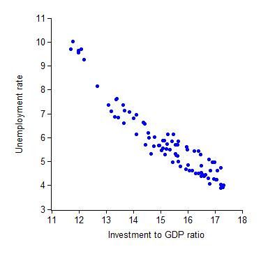
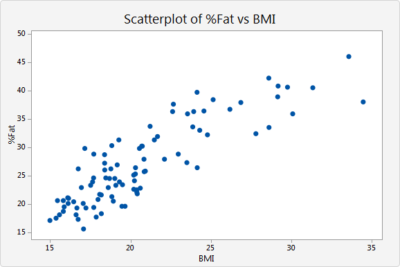
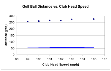
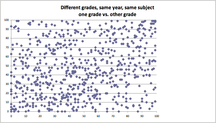
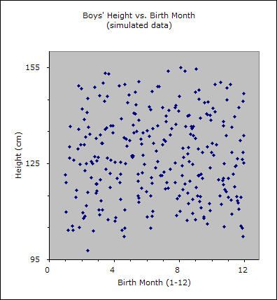
Scatter plot
Scatter plots are data visualizations which show a relationship between two or three variables. Each point on the scatter plot is placed based on a corresponding number on the horizontal X axis and vertical Y axis. By analyzing dots on the graph as virtual line, viewer is able to conclude correlation of two variables leading to one out of three results: positive, negative, and uncorrelated. Positive correlation occurs when there is a visible line from bottom left to top right. This indicates positive relationship between two variables. On the other hand, a visible line drew from top left to bottom right represents a negative correlation of two variables. However, if there is no correlation found on graph, it is considered as uncorrelated.
By adding a Z axis the graph becomes 3D scatter plot. In a 3D scatter plot, correlation cannot be found if dots are distributed randomly.
Because scatter plots represent and visualize a relationship of two variables, formulating a hypothesis is necessary as pre-processing of the graph.
Good examples
Bad example
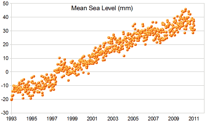
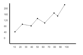
Line Graphs
A line graph, also known as a line chart, utilizes dots and lines to connect data points that represent quantitative values during a specific time period. Line graphs utilize dots as markers to better display fixed data points and lines to track the changes through time. This type of graphs are frequently utilized across many fields, being consistently used for depicting value adjustments during time periods.
The line graph consists of a horizontal x-axis and a vertical y-axis. Each axis is labeled with a distinct category. The x-axis is also called the independent axis because its values do not depend on anything; generally, time is placed on the x-axis since it continues to move forward regardless of anything else. The y-axis is also called the dependent axis because its values depend on those of the x-axis. For example, a line graph could depict the amount of money that a company had at a specific time period. In this case the x-axis would be displayed in: days, weeks, months, or years; while the y-axis shows revenue in dollars.
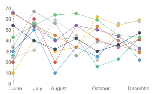
Line graphs may also display several lines of data in order to compare different value changes within a category. If more than a single line of data is displayed, each line should be distinct from one another and identified accordingly in a legend. An example of a multiple line graph would be the temperature changes of different cities throughout one year.
Examples:
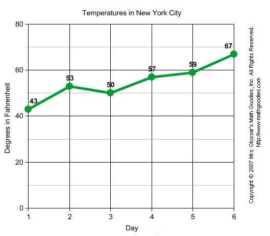
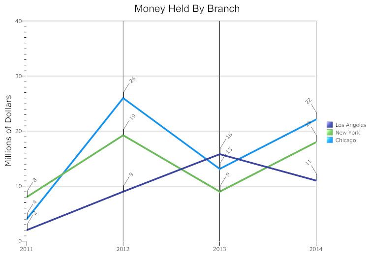
The line graph is a powerful visual tool for tracking marketing, finance, laboratory research, and weather monitoring.
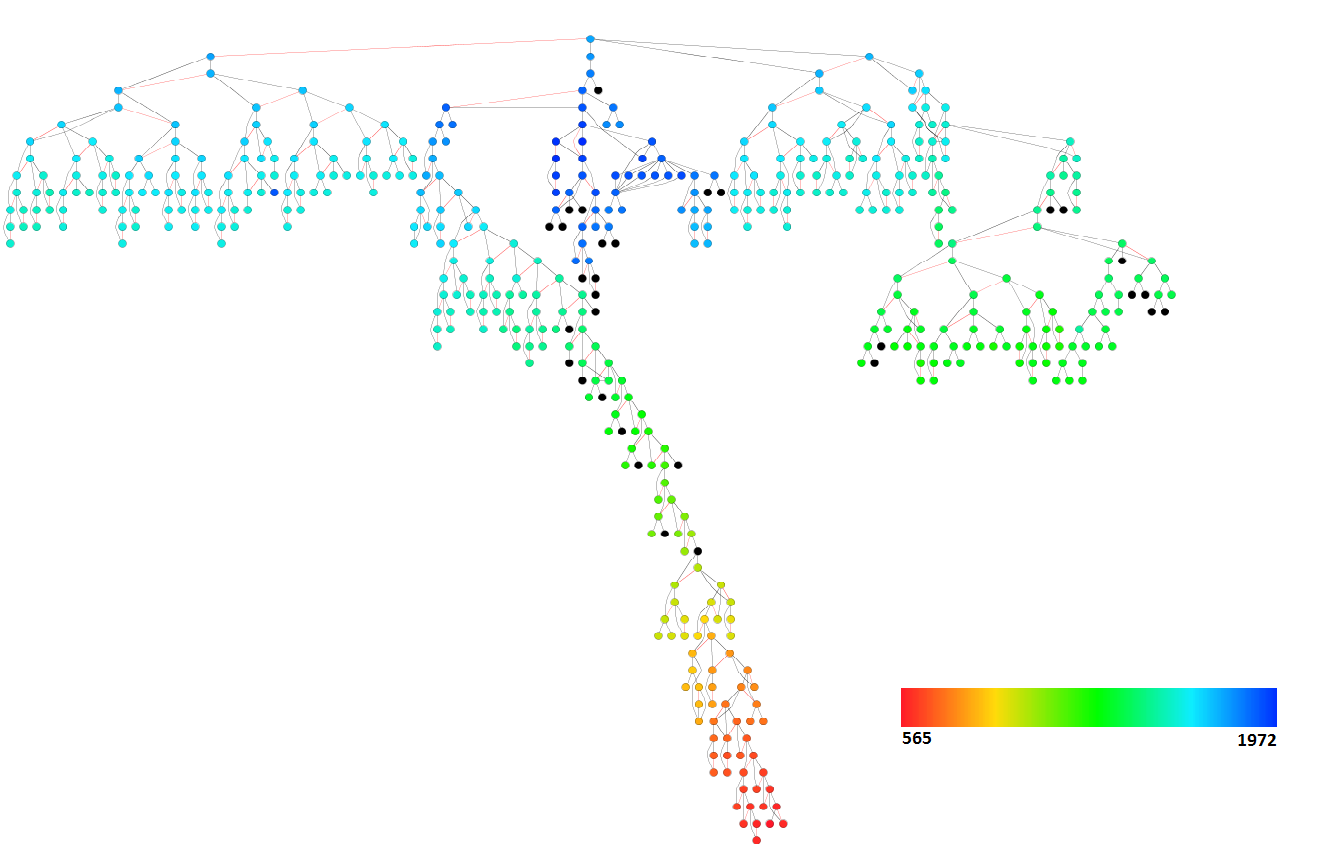
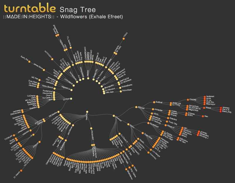
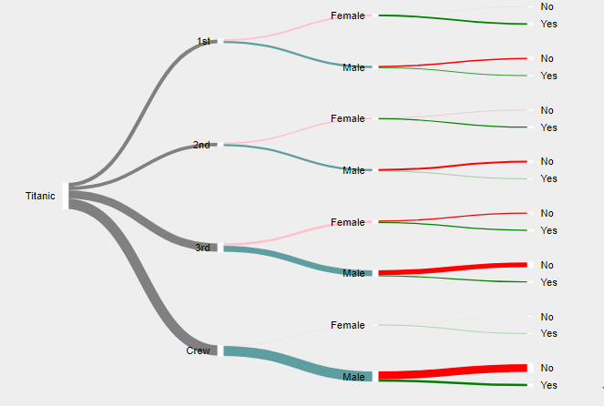
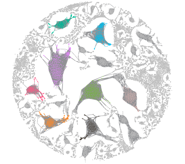
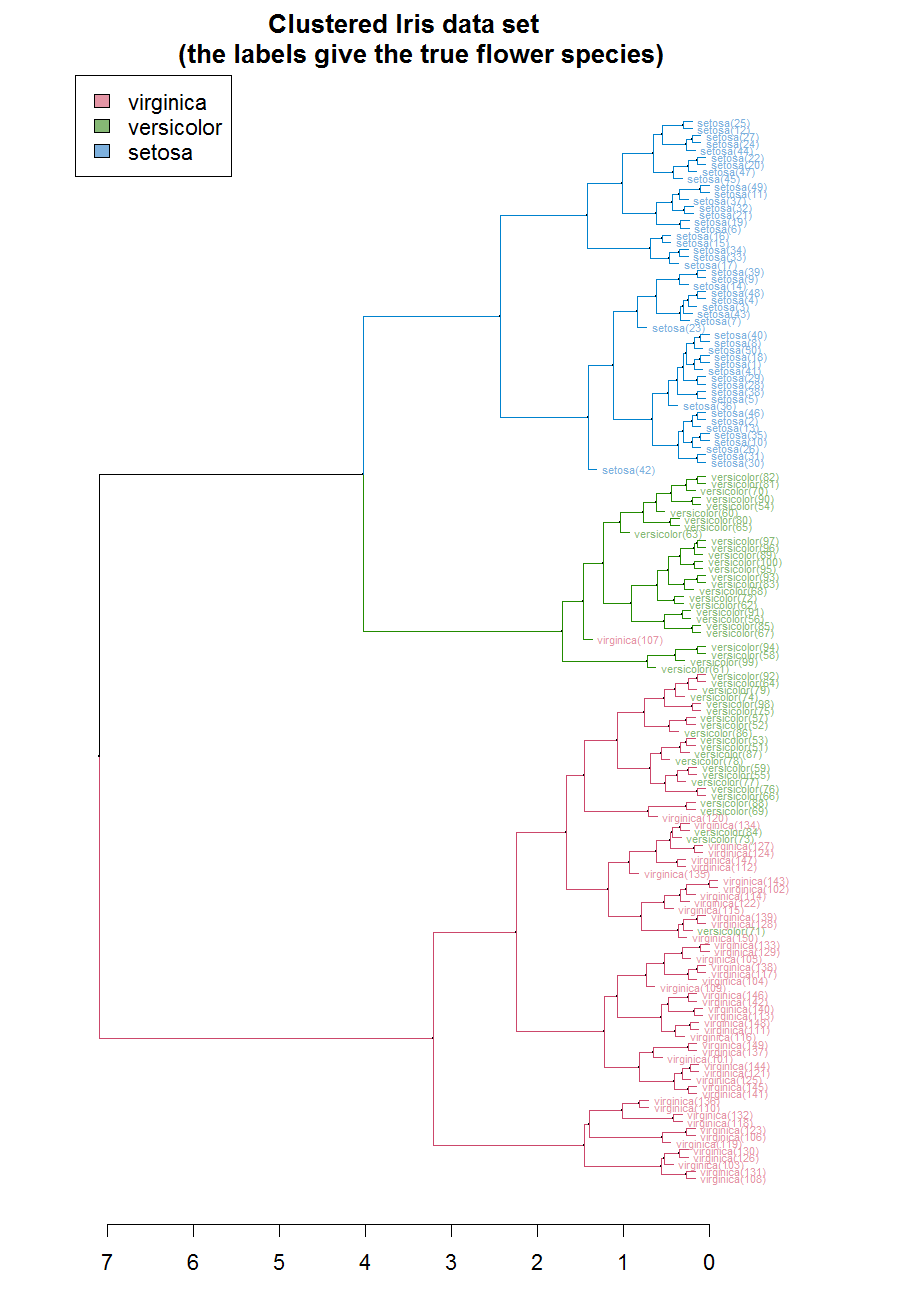
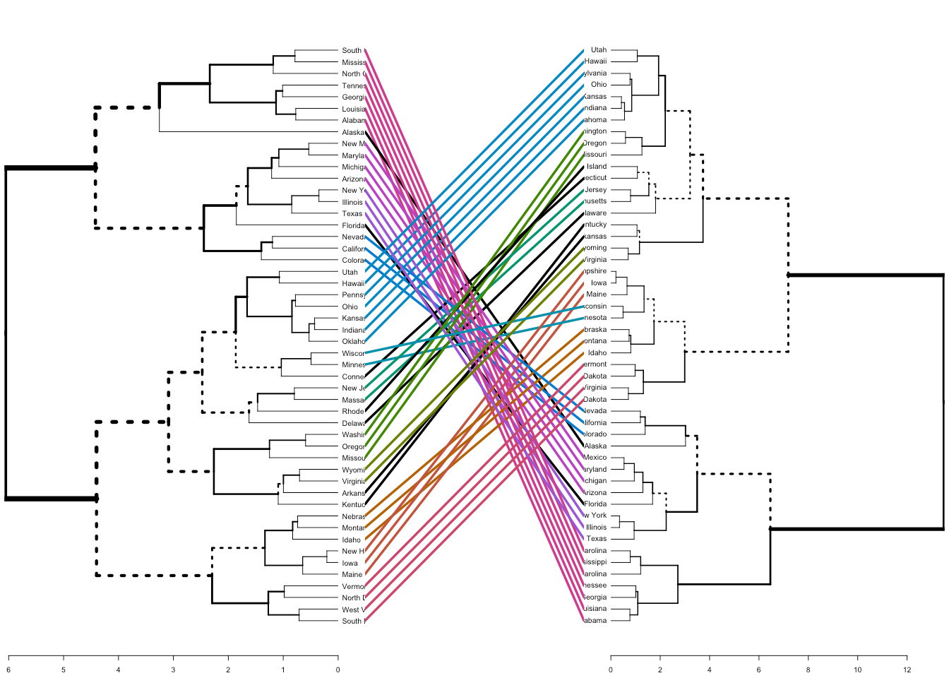
Dendrogram
Dendrograms are a type of diagram that represents data by stacking a tree form that connects points. There is hierarchical clustering as well. The height of the branches is a variable that contributes to the representation of the data. U shaped lines connect the data. Dendrograms are used in different contexts. Some of them include hierarchical clustering, computational biology, and polygenetics. Another purpose of dendrograms is to display heat maps.
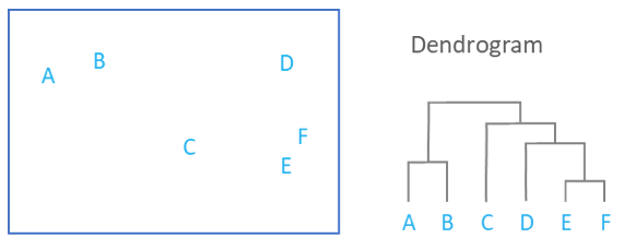
This image shows how a dendrogram would organize scatter plot data.
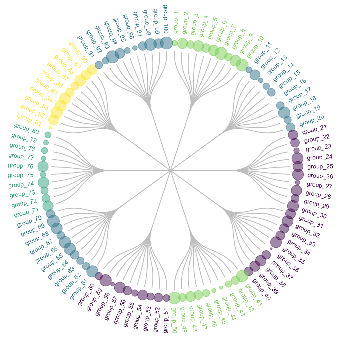
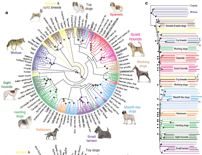
This is an example of how a dendrogram can be represented in a circular version. It is called a radial dendrogram.
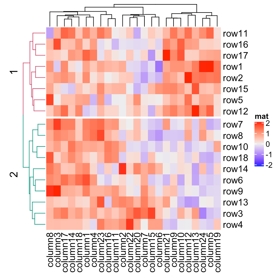
This shows how a heat map would be applied to a dendrogram.