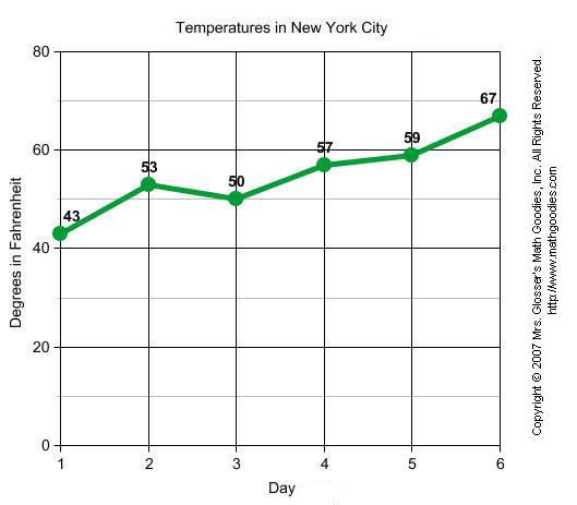
A line graph, also known as a line chart, utilizes dots and lines to connect data points that represent quantitative values during a specific time period. Line graphs utilize dots as markers to better display fixed data points and lines to track the changes through time. This type of graphs are frequently utilized across many fields, being consistently used for depicting value adjustments during time periods.
The line graph consists of a horizontal x-axis and a vertical y-axis. Each axis is labeled with a distinct category. The x-axis is also called the independent axis because its values do not depend on anything; generally, time is placed on the x-axis since it continues to move forward regardless of anything else. The y-axis is also called the dependent axis because its values depend on those of the x-axis. For example, a line graph could depict the amount of money that a company had at a specific time period. In this case the x-axis would be displayed in: days, weeks, months, or years; while the y-axis shows revenue in dollars.
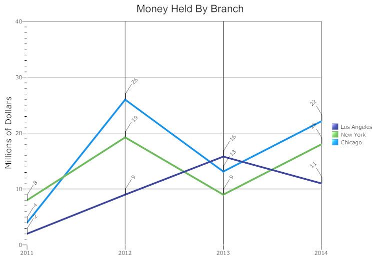
Line graphs may also display several lines of data in order to compare different value changes within a category. If more than a single line of data is displayed, each line should be distinct from one another and identified accordingly in a legend. An example of a multiple line graph would be the temperature changes of different cities throughout one year.
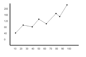
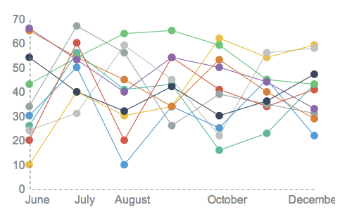
Examples: