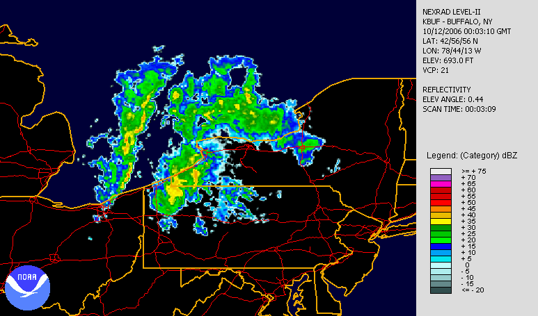
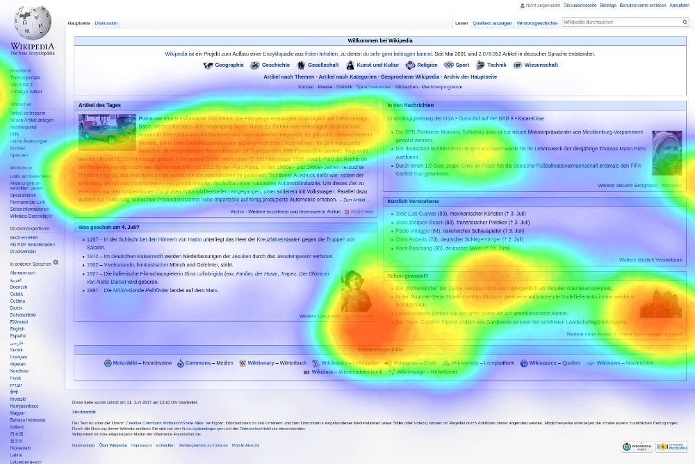
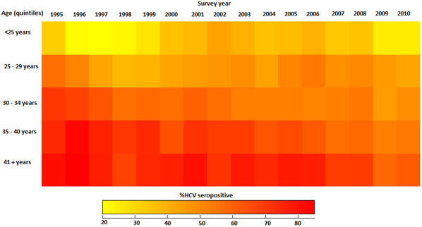
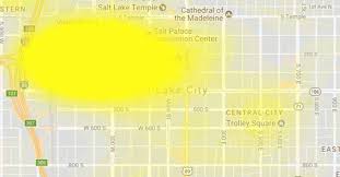
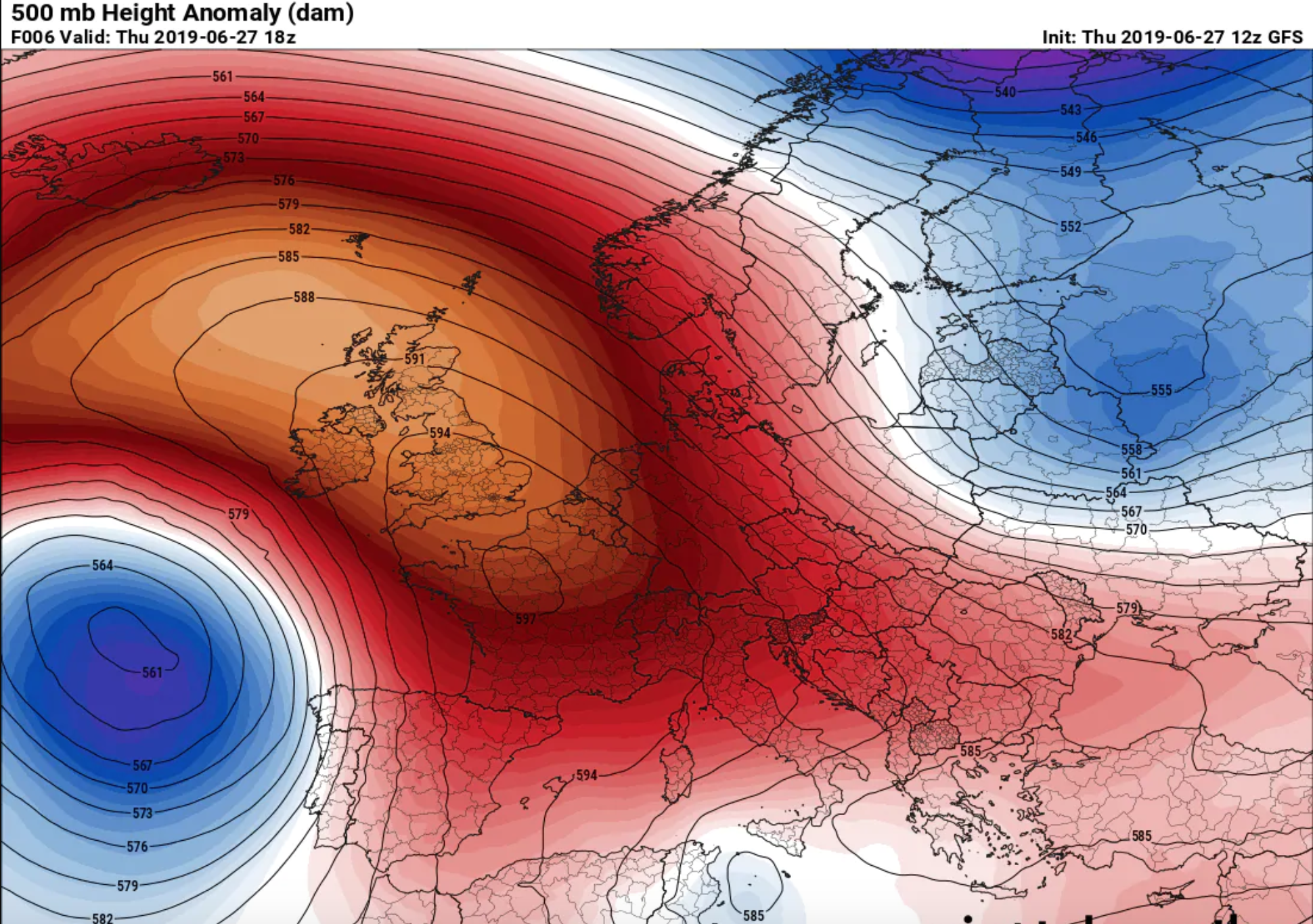
A heat map is a term that appears to encompass several different forms of recording data. The uses of a heat map vary greatly, but the design of a heat map relies heavily on the use of color to help the viewer understand the information. The most popular way a heat map is used is for the depiction of weather systems, and there is also an increasing use of them to track website traffic. Heat maps are created using a matrix, and the pre-processing ranges depending on the type of heat map. The more detailed heat maps are incredibly precise and require the use of computers to create. The use of color in heat maps is something that is both helpful and problematic. Color allows for an easier understanding and contrast between information, but also does carry different meaning and visual weights between viewers.