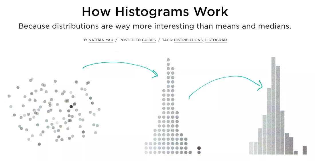
The word histogram is said to come from the name 'Historical Diagram' deriving from 1891.
A type of bar chart, the histogram, quickly lets you see the shape and distribution of a given set of continuous data. The values Histograms typically represent are integers.
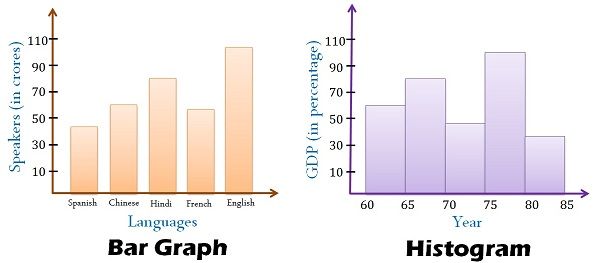
Unlike a standard bar chart, that has categories i.e. languages, histograms usually chart just one continuous variable along the x-axis such as years or ages.
A histogram uses area of a bar of the (width x height) - the main retinal variable used to depict data in a histogram would be the size of each column. Whereas a bar graphs have equal width between columns and use height only as a visual cue.
Yet orientation, value, color hue, position, and shape all can come into play for the creation of a histogram.
Simple steps to construct a histogram
- Identify your data and what you are trying to visualize for example a given set of ages:
36 25 38 46 55 68 72 55 36 38
67 45 22 48 91 46 52 61 58 55
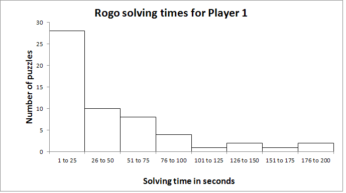
2. The list above shows twenty different ages with not much relational sense to them. However if we create ranges or "bins" to sort the ages in 10 year intervals we can begin to map their frequency
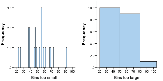
It is important that your bins are not too small or too large. The bins on the X-axis now allow you to chart the frequency for which they occur on the Y-axis.
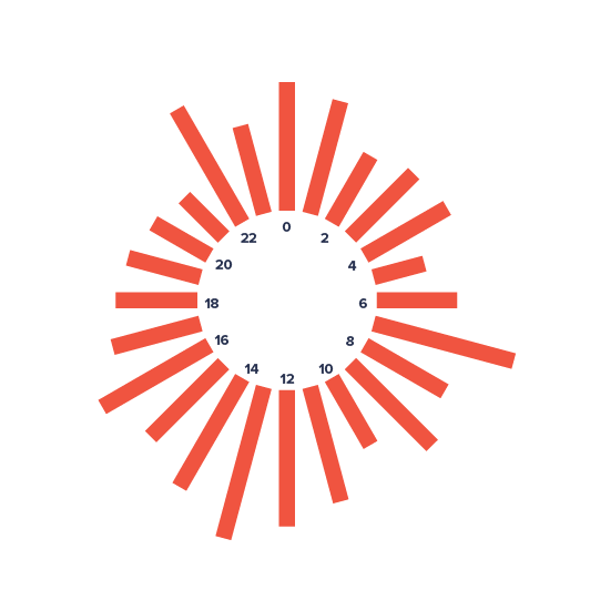
Histograms can also orient their timeline along a spiral or circular shape which allows to compare cycles while keeping a continuous timeline.
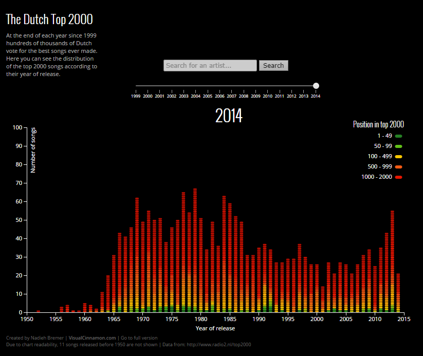
+ examples :)
- examples :(