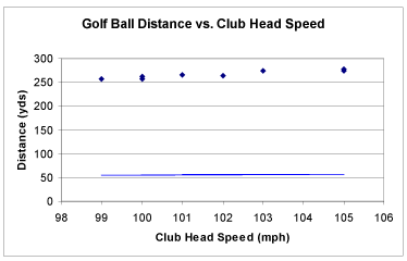
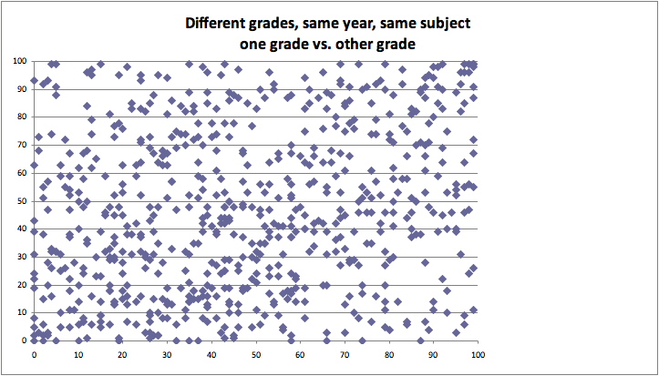
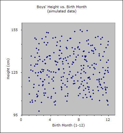
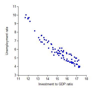
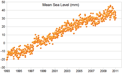
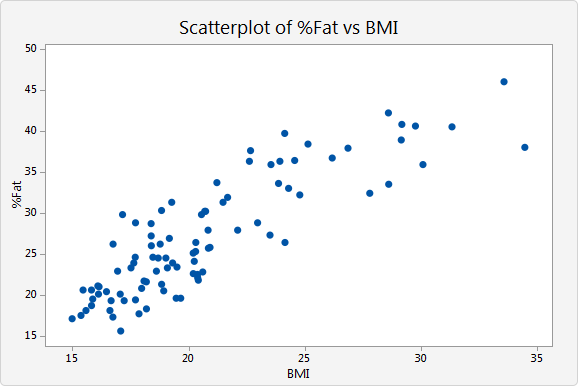
Scatter plots are data visualizations which show a relationship between two or three variables. Each point on the scatter plot is placed based on a corresponding number on the horizontal X axis and vertical Y axis. By analyzing dots on the graph as virtual line, viewer is able to conclude correlation of two variables leading to one out of three results: positive, negative, and uncorrelated. Positive correlation occurs when there is a visible line from bottom left to top right. This indicates positive relationship between two variables. On the other hand, a visible line drew from top left to bottom right represents a negative correlation of two variables. However, if there is no correlation found on graph, it is considered as uncorrelated.
By adding a Z axis the graph becomes 3D scatter plot. In a 3D scatter plot, correlation cannot be found if dots are distributed randomly.
Because scatter plots represent and visualize a relationship of two variables, formulating a hypothesis is necessary as pre-processing of the graph.
Good examples
Bad example