This is a collective research project providing examples and discussion of the basic building blocks of visual data representation.
Chernoff Faces
Blah Blah Blah
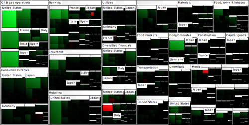
Tree map
It uses rectangles to display hierarchical data. The color and size dimensions are correlated in some way with the tree structure.
Its advantage is that it simultaneously show the big picture, comparisons of related items, and allow easy navigation to the details. However, it is really hard to get all the rectangles at the correct ratios in correlation to the data.
Each box in a treemap can show two measures:
- Size of the boxes should be a quantity measure. The measures should sum up along the hierarchical structure of the data. The sum of all the elements in one branch need to sum to the value of the branch as a whole. Therefore, you can’t use ratios or dates or any other measure you wouldn’t use in a pie chart.
- Color of the boxes is best suited to a measure of performance or change such as growth over time, average conversion rate, or customer satisfaction.
A rectangle area is proportional to a specific dimension of the data. Often the leaf nodes are colored to show a separate dimension of the data.
3 Good examples: (description underneath the images)
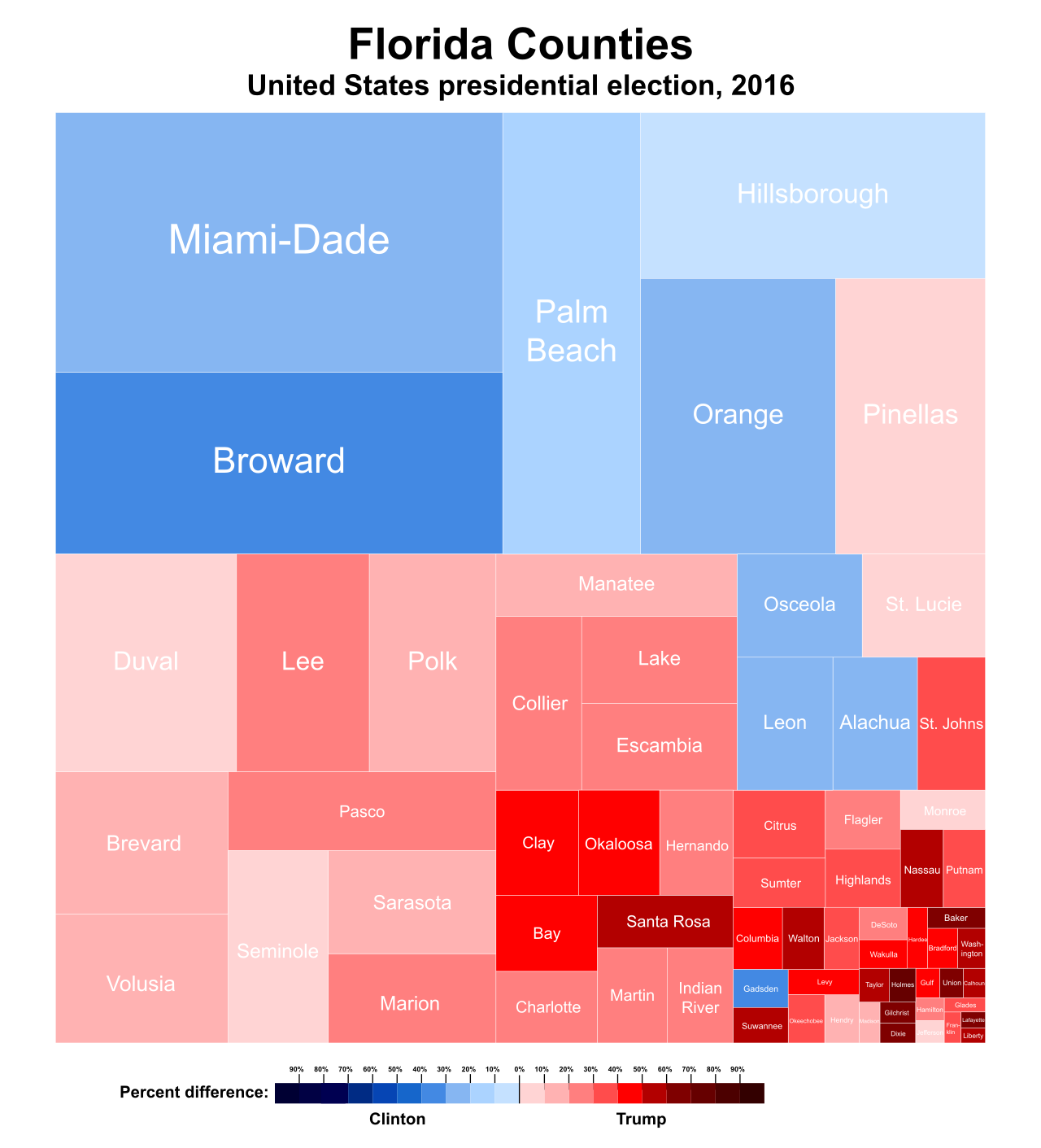
1) Treemap of the 2016 United States presidential election results in Florida by county, on a color spectrum from Democratic blue to Republican red.
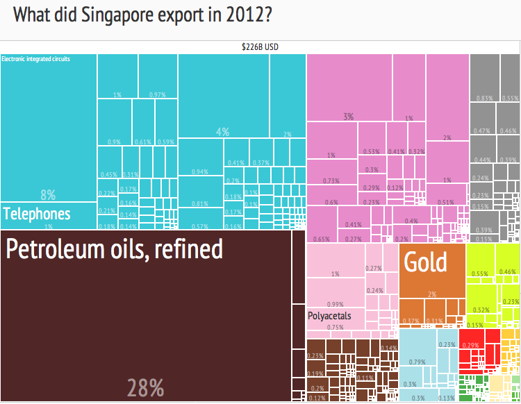
2) Treemap of Singapore's exports by product category, 2012. The Product Exports Treemaps are one of the most recent applications of these kind of visualizations, developed by the Harvard-MIT Observatory of Economic Complexity.
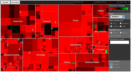
3) The King of Treemaps — Smart Money’s Map of the Market — offers a classic set of measures: size represents market cap; color represents change in market cap.
3 Bad Examples:
1) The category labels use space -- almost as if you added slices to a pie chart for labeling. This approach distorts the values by arbitrarily using space, making it harder for the viewer to visually compare sizes.
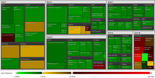
2) Labels clutter up this tree map, can't read, not helpful!
3) These text boxes look clunky, obscure some of the data, and don’t always fit into the allotted space.
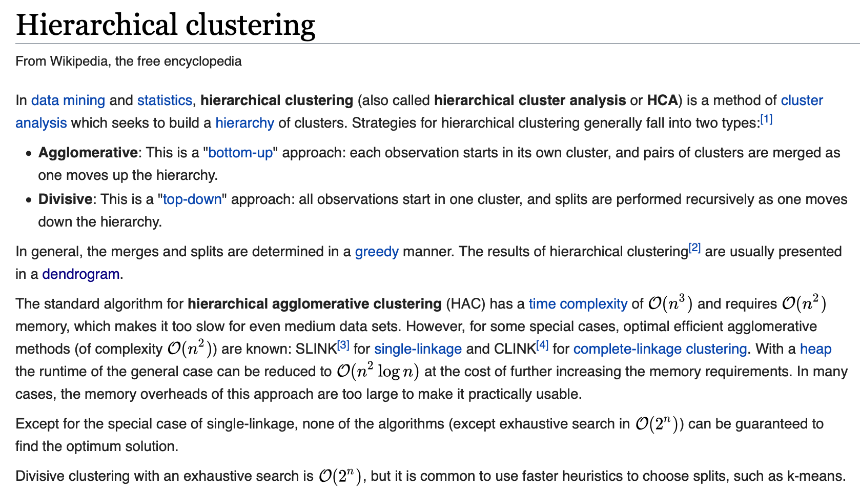
DENDROGRAM
A dendrogram is a stacked tree that is shown connected to points, where the height of the branches show an additional variable. Often used to depict the stregnth of clusterings in a matrix.
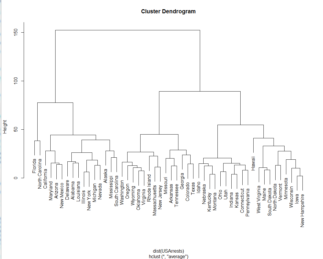
For a clustering example, suppose that five taxa (a to e) have been clustered by UPGMA based on a matrix of genetic distances. The hierarchical clustering dendrogram would show a column of five nodes representing the initial data (here individual taxa), and the remaining nodes represent the clusters to which the data belong, with the arrows representing the distance (dissimilarity). The distance between merged clusters is monotone, increasing with the level of the merger: the height of each node in the plot is proportional to the value of the intergroup dissimilarity between its two daughters (the nodes on the right representing individual observations all plotted at zero height).

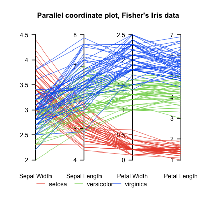
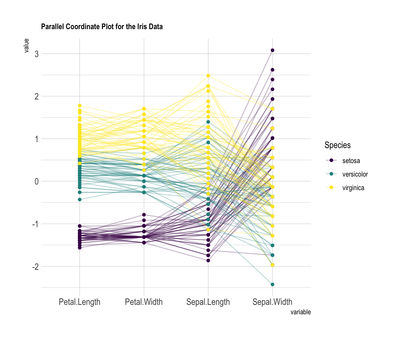
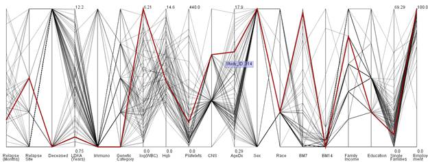
Linear and radial parallel coordinates
Linear parallel coordinates
Parallel coordinates are a common way of visualizing high-dimensional geometry and analyzing multivariate data.
To show a set of points in an n-dimensional space, a backdrop is drawn consisting of n parallel lines, typically vertical and equally spaced. A point in n-dimensional space is represented as a polyline with vertices on the parallel axes; the position of the vertex on the i-th axis corresponds to the i-th coordinate of the point.
Radial Parallel Coordinates / Radar Chart
A radar chart is a graphical method of displaying multivariate data in the form of a two-dimensional chart of three or more quantitative variables represented on axes starting from the same point.
The relative position and angle of the axes is typically uninformative, but various heuristics, such as algorithms that plot data as the maximal total area, can be applied to sort the variables (axes) into relative positions that reveal distinct correlations, trade-offs, and a multitude of other comparative measures.
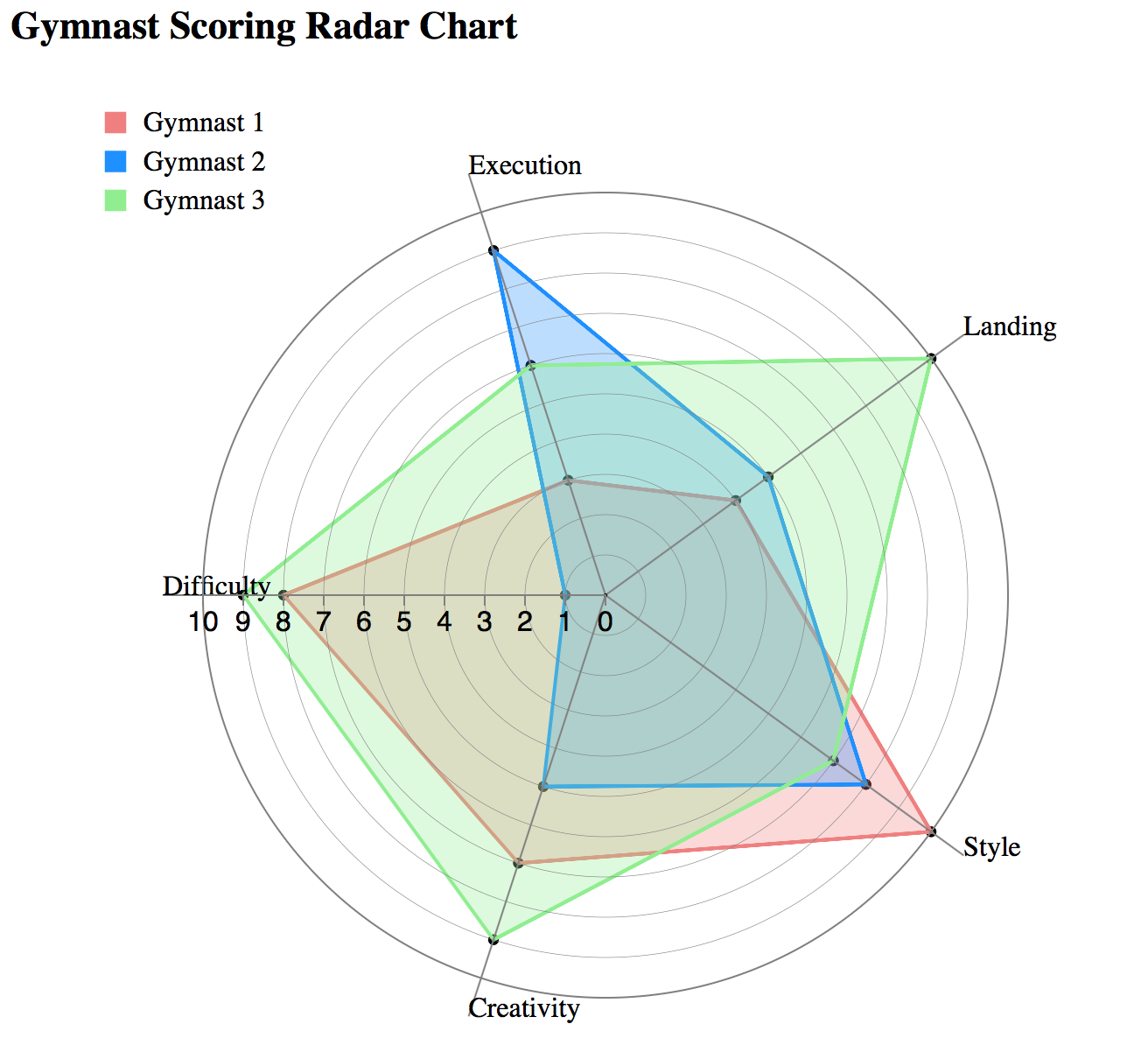
Advantages
- The number of dimensions that can be visualized is only restricted by the horizontal resolution of the screen.
- Correlations between variables in the dataset can be spotted easily.
Disadvantage
- Level of clutter present in the visualization reduces the amount of useful information one can perceive.
- The overlaying of data lines for common data values among data entries
- As the axes get closer it may become more difficult to perceive structures or data relations.
pre-processing
determine axes order
heat map
- a map that uses color or some other feature to show an additional dimension, for instance a weather map depicting bands of temperature.
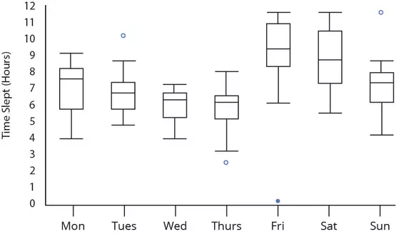
Box Plots
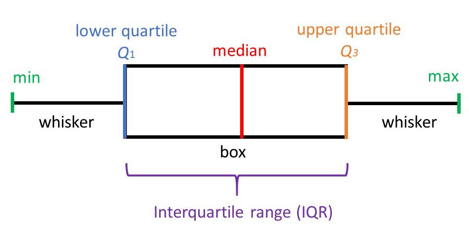
Invented by John Tukey, the Box Plot, also known as the box and whisker plot, is a two dimensional plot that shows a point and its first (and sometimes second) standard deviation. It is a useful depiction of the fact that data is often not simply discrete points, but ranges of likelihood. Used in explanatory data analysis to visually show the distribution of numerical data and skewness, the box plot displays the data quartiles (or percentiles) and averages. The median of the data is just the number that is in the middle of the set after it is arranged from least to greatest. The minimum and maximum are the smallest and largest number in the data set. Q1 and Q3 are can be thought of as the median of the data left and right of the median respectively.
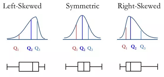
Box plots divide a set of data into sections that each contain approximately 25% of data in that set. Containing 50% of the data within, the box between the whiskers shows the interquartile range (IQR) which can be found by subtracting Q1 from Q3. From the position of the median and box, the distribution of the data can then be determined to be either normal (symmetrical) or skewed (left or right).
Box plots are also a good way to determine outliers within a set of data. Data points that are located outside the whiskers are called outliers and they are either smaller than Q1 by at least 1.5 times the IQR or larger than Q3 by at least 1.5 by at least 1.5 times the IQR.
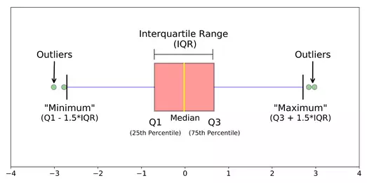
And finally, box plots can be used to compare and contrast the dispersion between different samples of data. The longer the box the more dispersed the data is and the shorter the box the less dispersed. Another type of dispersion can be seen with the lengths of the whiskers between samples as the two ends show the range of a set of data. Larger range indicates a wider distribution and thus, more scattered data.
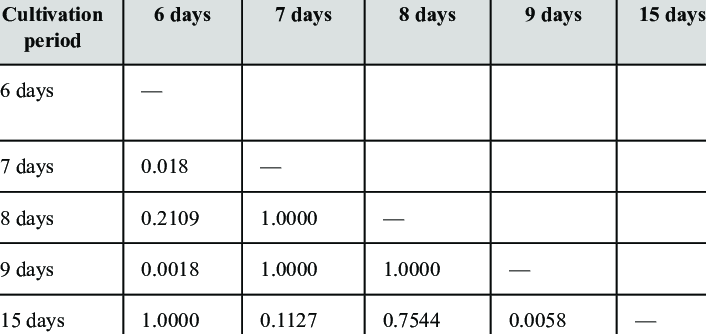
Numeric Matrix / Half Matrix
matrix - any two dimensional set of numbers, colors, intensities, sized dots, or other glyphs.
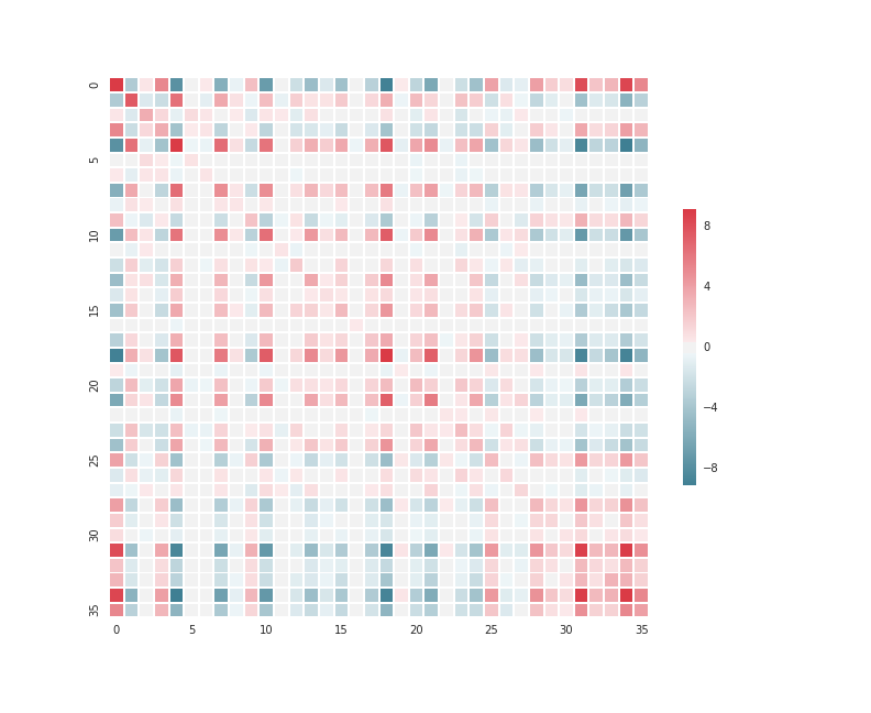
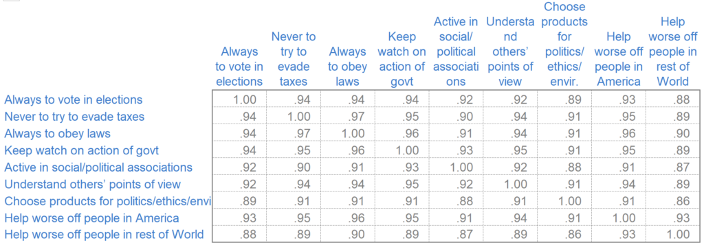
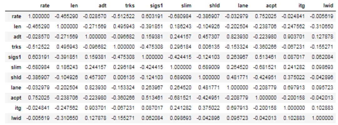
half matrix - where only half a matrix is shown, usually used for similarities, or where two items are being compared against one another (i.e. the D' table). Only half the matrix is needed because it is the same when reflected across its diagonal.
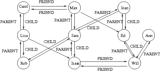
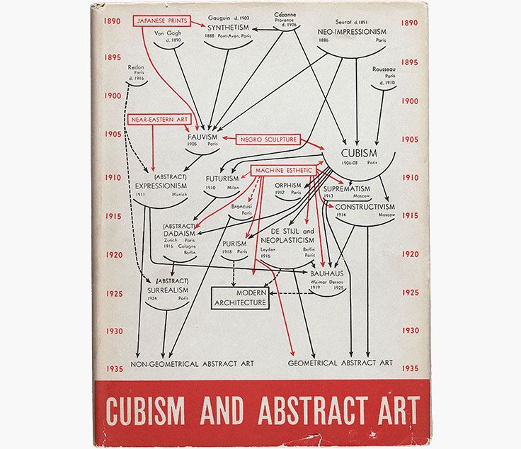
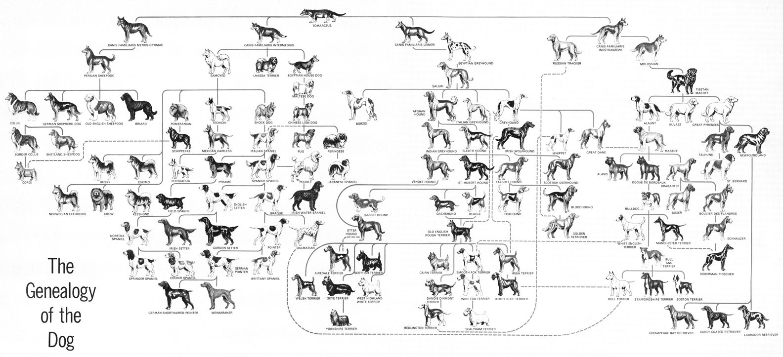
Tree/Graph
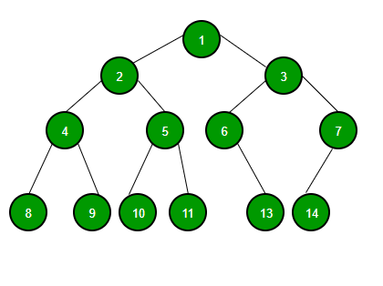
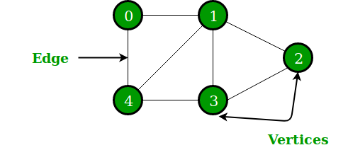
A graph has finite sets of vertices and edges. Vertices are otherwise referred to as nodes, and two of these are connected by an edge like shown in the above image. A tree has a set of nodes, but not necessarily edges. Instead, it has one specific node called the root: this would be "1" in the above picture. The other nodes branch off into subtrees of the root. These disconnected subtrees in graph theory can be interpreted as sets of data: Tn . As opposed to graphs, trees usually have a sense of visual hierarchy in its presentation. Below show examples of how graphs and trees are used in real life to make a better sense of the two: