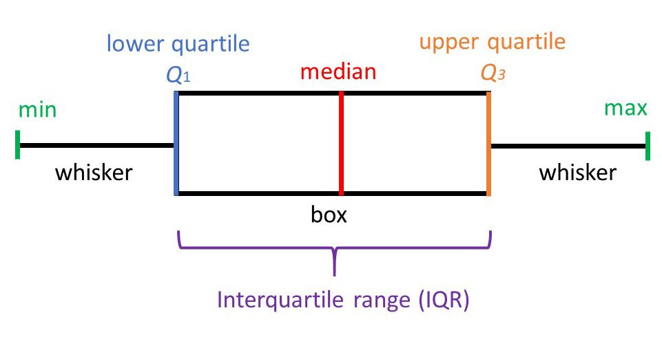
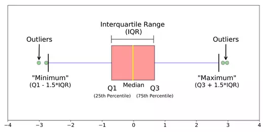
Invented by John Tukey, the Box Plot, also known as the box and whisker plot, is a two dimensional plot that shows a point and its first (and sometimes second) standard deviation. It is a useful depiction of the fact that data is often not simply discrete points, but ranges of likelihood. Used in explanatory data analysis to visually show the distribution of numerical data and skewness, the box plot displays the data quartiles (or percentiles) and averages. The median of the data is just the number that is in the middle of the set after it is arranged from least to greatest. The minimum and maximum are the smallest and largest number in the data set. Q1 and Q3 are can be thought of as the median of the data left and right of the median respectively.
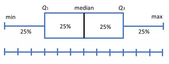
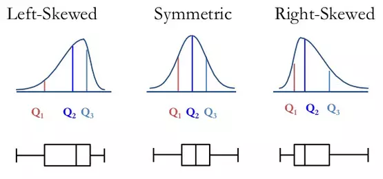
Box plots divide a set of data into sections that each contain approximately 25% of data in that set. Containing 50% of the data within, the box between the whiskers shows the interquartile range (IQR) which can be found by subtracting Q1 from Q3. From the position of the median and box, the distribution of the data can then be determined to be either normal (symmetrical) or skewed (left or right).
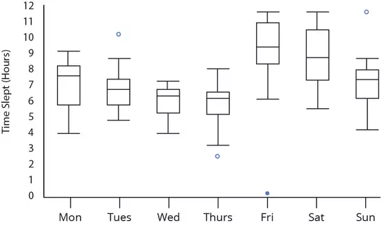
Box plots are also a good way to determine outliers within a set of data. Data points that are located outside the whiskers are called outliers and they are either smaller than Q1 by at least 1.5 times the IQR or larger than Q3 by at least 1.5 by at least 1.5 times the IQR.
And finally, box plots can be used to compare and contrast the dispersion between different samples of data. The longer the box the more dispersed the data is and the shorter the box the less dispersed. Another type of dispersion can be seen with the lengths of the whiskers between samples as the two ends show the range of a set of data. Larger range indicates a wider distribution and thus, more scattered data.