Poor Form
Read Healy's introductory chapter from Data Visualization for Social Science:
Use the tag “R1” when you post your assessment of the reading and the questions raised.
Poor Form
Read Healy's introductory chapter from Data Visualization for Social Science:
Use the tag “R1” when you post your assessment of the reading and the questions raised.
There are 3 possible aspects contribute to the badness of a piece of data visualization discussed in the reading. They are aesthetic, substantive, and perceptual.
The aesthetic parts is mainly about finding the balance between data to ink ratio, meaning the relationship between data and design elements. Excessive and content-free decorations should be cleared off. The design/aesthetic should also take the detail complexity into account while presenting dense information.
The substantive aspect is the problem innate within the data itself. Problem may lies in the categorization of data, the sorting methods, and etc. In such case, no matter how clear the visual design is, the graph would inevitably lead to misunderstanding of the data.
The perceptual aspect mainly discusses how certain visuals reads differently according to human's eye and cognitive psychology. We tends to read more accurately and thus more willingly to read data on a fixed baseline. Our brain process length difference better than angles and areas. Different hues of color would mostly pops out more easily than different shapes. The gestalt rule explains how we read a group of different visuals: we group objects according to their similarity and proximity, and base on the connections we see continuity. All these affect the design choice within the data visualization, for all would help audience to read the graph easier or hinder their understandings.
I agree with most of the points discussed in the reading. I do wonder to what extent do the design elements become decorative and would be counted by the author as "decorative". Also, the purpose of a piece of data visualization should lie in its clarity to convey the data or its emotional effect on the audience.
In the introductory chapter of Kierann Healy's Data Visualization for Social Science, the author iterates the importance of understanding and creating data visualization that is both highly functional and highly understandable.
Data surrounds us, and the visual explanation of information relevant to viewers allows for us to create correlations and relationships that we would not be able to when presented with a set of numbers or statistics. Healy notes that the outcome one takes away from a visualization can greatly vary based upon choices made in order to represent the data.
Healy specifically notes three aspects that make bad figures bad, these being bad taste, bad data, and bad perception. Bad taste may be simply explained in some ways as over-design... when designers add unnecessary or distracting elements that make interpreting the intended message harder.
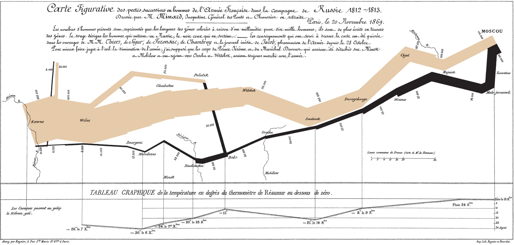
Healy cites Edward Tufte's thoughts on Charles Joseph Minard’s visualization of Napoleon’s retreat from Moscow, noting that the figure (regarding the image above) "can be described and admired, but there are no compositional principles on how to create that one wonderful graphic in a million.”
While the author seems to state that routine and more imitable data images are what one should strive for and are what are considered well designed, I would say that the content of data to be explained drives the design of the graphic used to explain it and thus, does not neccessarily have to be repeatable or multipliable.
Regarding the balance between content and the graphics, In Healy's own words, it is "better to begin by thinking about the relationship between the structure of your data and the perceptual features of your graphics." To me, this was one of the most important pieces of the reading, as it simplifies the basic concept of data visualization and what one should strive for in order to achieve harmony between understanding the message of data, and its visual appeal.
While data visualization deals with objective, quantifiable data, there is definitely no definitive answer when tasked with presenting the information in the best possible way. When considering the goal of presenting data, one must ask what the purpose of the presentation is.
I would ask whether one of data visualizations subliminal goals is to instill human reaction, either emotional or opinionated.
The introductory chapter of Healy’s Data Visualization for Social Science, narrates the importance of data visualization. The chapter explores good and bad uses of data visualization in an attempt to demonstrate the overall uses and applications of data visualization. I believe that Healy opens up with a beautiful interpretation about how to approach data visualization in stating, "it is better to begin by thinking about the relationship between the structure of your data and the perceptual features of your graphics." I agree with Healy. It is important to think about what design elements you can use to best narrate the story that your data is trying to tell. The chapter provided insights about how design factors such as color, line, and shape can be used to establish a hierarchy of information within these visualizations. The chapter highlighted the relationship between the structure of data and the perceptual features of the graphics. Overall, this chapter serves to show how visualization allows us to explore, understand, and explain data.
Within the “Bad Data” portion of the reading, Healy discusses how some graphics take on a misleading nature. In this way, creators have the ability to shift the narrative surrounding the data. They can use small changes of value on an axis to create a misleading depiction of the information. Therefore, I find it fascinating to think how something rooted in fact can take on a distorted truth by means of manipulating the axes. This ties in with Healy’s ideas of how aesthetic, substantive, and/or perceptual issues can arise within data visualization. In this way, it is interesting to view the ethics of data visualization. Is it possible that “fake news” can exist within something that is supposed to be truthful? How does data visualization then become paradoxical? How can design align itself with deception? Healy references Tufte to explain how Tufte believed that graphical excellence was found in telling the truth about data. Therefore, I feel like ethics lay at the core of this type of design.
When thinking further about perception in relation to data, it is interesting to consider how Healy speaks of optical illusions. I have never considered this correlation prior to reading Healy’s analysis of the matter. Furthermore, I enjoyed Healy’s analysis of how color theory aids the encoding of visual information. Healy describes the importance of shape and color in relation to graphing data. I look forward to employing methods of color theory to my work. I find that principles of design can be a key component in creating understanding for the viewer. I am curious as to how much the average viewer relies on a legend or key to understand visualization. How can we create successful interations where users can understand the visualization without a key?
In the introductory chapter, Healy highlights the importance of cognitive perception in the construction and reception of data visualization as the theoretical backbone for good data visualizations. Regardless of its forms, data visualization should prioritize the audience to select conscious design choices reflective of the creator’s ideology and tailored for the context of the audience because visualizations bear the responsibility of structuring a dataset and indicating a correlation. Consequently, graphs failed to contain these functions would be considered bad. Healy lays out three aspects of a bad visualization: bad taste, bad data, and bad perception. Bad tastes hinder the clarity of the data; bad data fail to serve the central message of the graph; bad perceptions present datasets in visually confusing manners. Specifically, Healy focuses on the perception of data visualization seeing its intricate yet undismissable ability to direct the human mind with lines, shapes, and colors. The designer of a data visualization has to bear in mind the visual cues these elements bring about when designing a graph.
However, one of Healy’s basic qualifications for what composes a bad visualization seems to me slightly questionable. In his definition of bad data, Healy instantiates misleading use of data with the example of the New York Times graph “How Stable Are Democracies? ‘Warning Signs Are Flashing Red’” (Taub, 2016). In terms of its physical nature as a data visualization, of course, this graph is inarguably bad as it misrepresents the raw data and over exaggerates the tendencies. Yet Healy overlooked a vital component of data visualization––the visualization of a dataset is to relay a message to its audience. There should not be any judgment over whether a message is “good” or “bad” when the focus is on the data visualization itself. Therefore the visuals should not be called “bad” if it obviously closely adheres to the message. They are leading exactly in the direction the creator intended. In this sense, the New York Times graph might be a “bad” data visualization at most but a highly successful communicational tool.
One particular takeaway I took from this reading was the fact that in interpreting data trends, it is essential for one to look at both the general dataset alongside the graph visual. If you are able to have the dataset on hand, the chances of a visual bias via graph type or coloration and distribution is less likely. On the other hand, if the bare numbers end up being overwhelmingly large in count, it is helpful to have a graph since outliers are easier to identify amidst the data, or other patterns.
The idea of "less is more" can be readily applied to graphs. If there are too many distracting design elements, the data becomes more of a graphic rather than a display of data. It may be visually appealing, however the crucial point—the data— is often lost in the visual hierarchy.
But it is also noted that more confusing, yet distinct illustrative graphs tend to linger on the minds of viewers more. Due to the graphic possessing more personality, be it colors or the strange monster creature of 'Monstrous Costs' by Nigel Holmes, viewers tend to associate more personal feelings over simple data graphs. In my honest opinion, this becomes a case where the designer must determine if he or she would like to prioritize striking imagery that interests and captivates the viewer, or straight and dry data graphs that helps deliver the information more directly and in more clarity.
The average importance of democracy versus decade of birth graph is another interesting case. While it is important to show the full score of ratings, the small intervals that the y-axis holds creates a feeling of great discrepancy between the generations despite the overall rating to be rather high. You can see a great dip between the 30s and 90s generation in Great Britain, but the actual figures are merely somewhere around 7.3 versus 9.1.
Most of the time, I try to avoid using unordered hues as my palette choice for visuals as I believe that it is far more aesthetic to have a sequential or gradual color set. However, it does make sense when you are graphic several groups of data, as showing a randomized yet equal in value set of colors can help eliminate certain instances of unconscious visual bias.
The introductory chapter shows how Kierann Healy thinks about elements that make a figure bad. Healy describes that several diagrams and charts have unnecessary “junks” that makes the whole thing complicated. I do agree that the “life expectancy: 2007” diagram shown in section 1.2 is definitely a bad designed diagram with unnecessary design elements. The drop shadow of the bars and the text is just making the whole graph hard to read. A good diagram is usually both aesthetically pleasing and easy to understand. But the “chartjunk” is not always a bad thing because it can also make the chart memorable and appealing to the audience.
However, even though the diagram has good taste and good data, it cannot represent everything - it can be potentially misleading or biased. Human perception is playing an interesting role here because we always try to interpret and perceive something out of a diagram. Maybe the original data do not suggest certain ideas or patterns, but the brain makes them after it sees the data’s diagram. This is why Healy suggests that a diagram can mislead the audience and even the creator unintendedly. I agreed on this part a lot, because it is possible that a designer uses this quality of data visualization to mislead and persuade the audience to accept the designer’s thoughts and opinions.
I’m not sure how I feel about this chapter because I was trained as a graphic designer to create aesthetically pleasing works. So when it comes to data visualization, it is interesting that several good designed charts listed by Healy seem somehow boring and unappealing to me. According to this chapter, maybe many other data visualizations can be considered as “bad” (for example, some of Giorgia Lupi’s works may be “bad” under this circumstance. )