I think the strongest point to successfully creating an effective graph are relative differences affected by perception and ‘illusion.’ It is almost an ethical issue of ‘how should I skew this data to work for the point I am trying to make.’
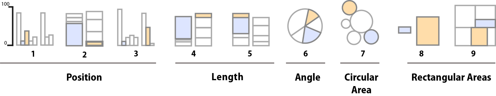
I thought the breakdown of Figure 1.22 is very interesting because it sits at the breakdown of what people are visually breaking down and trying to find out by comparing the segments (example: types 1- 3use position...type 4-5 use length and pie charts are viewed by angle size). According to the article, people are not good at distinguishing angles, sizes, and areas.
I still don’t really comprehend fully what qualitative and quantitative graphs look like or their purpose. I understand that one qualitative is more about the groups and quantitative is about the numbers but I don’t understand separating them–what's the point?