Treemaps are commonly found on data dashboards. Designers often choose them to add visual variety on a dense dashboard. However, treemaps are a complex visualization and present many obstacles to quick comprehension (which is the main requirement for any information displayed on a dashboard).
Creating a tree map involves choosing two dimensions of the data, color-coding one dimension and defining a "tiling algorithm" for the dimension represented by area. The tiling algorithm determines how the rectangles are sub-divided into rectangles of specific area (corresponding to the data). Tree maps are most legible when the area of sub-rectangles have an aspect ratio close to one.
Treemaps rely on area (and possibly color) to encode the value of a variable, and therefore, although treemaps can convey overall relationships in a large data set, they are not suited for tasks involving precise comparisons. Treemaps also should not be used if the data is not hierarchical.
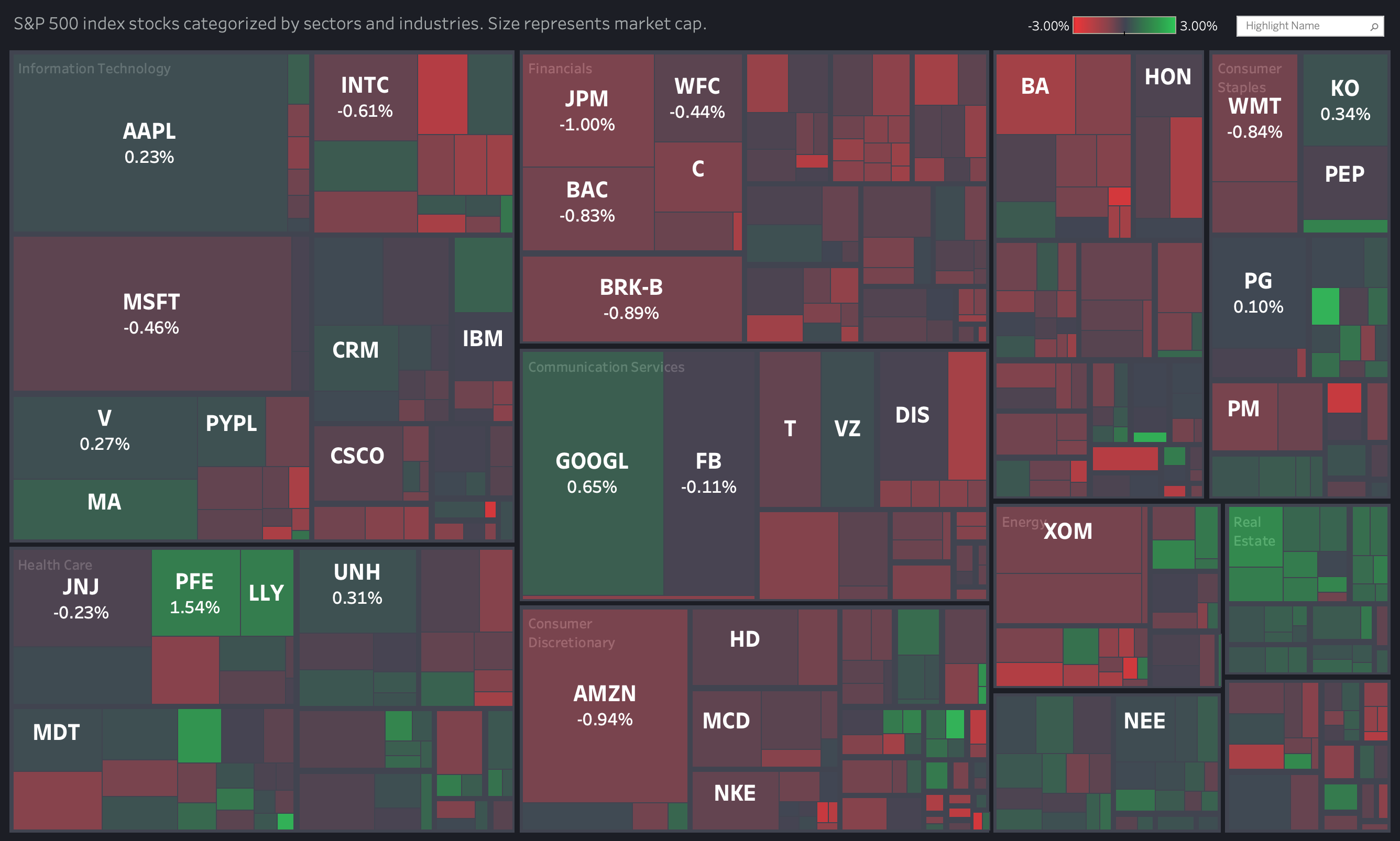
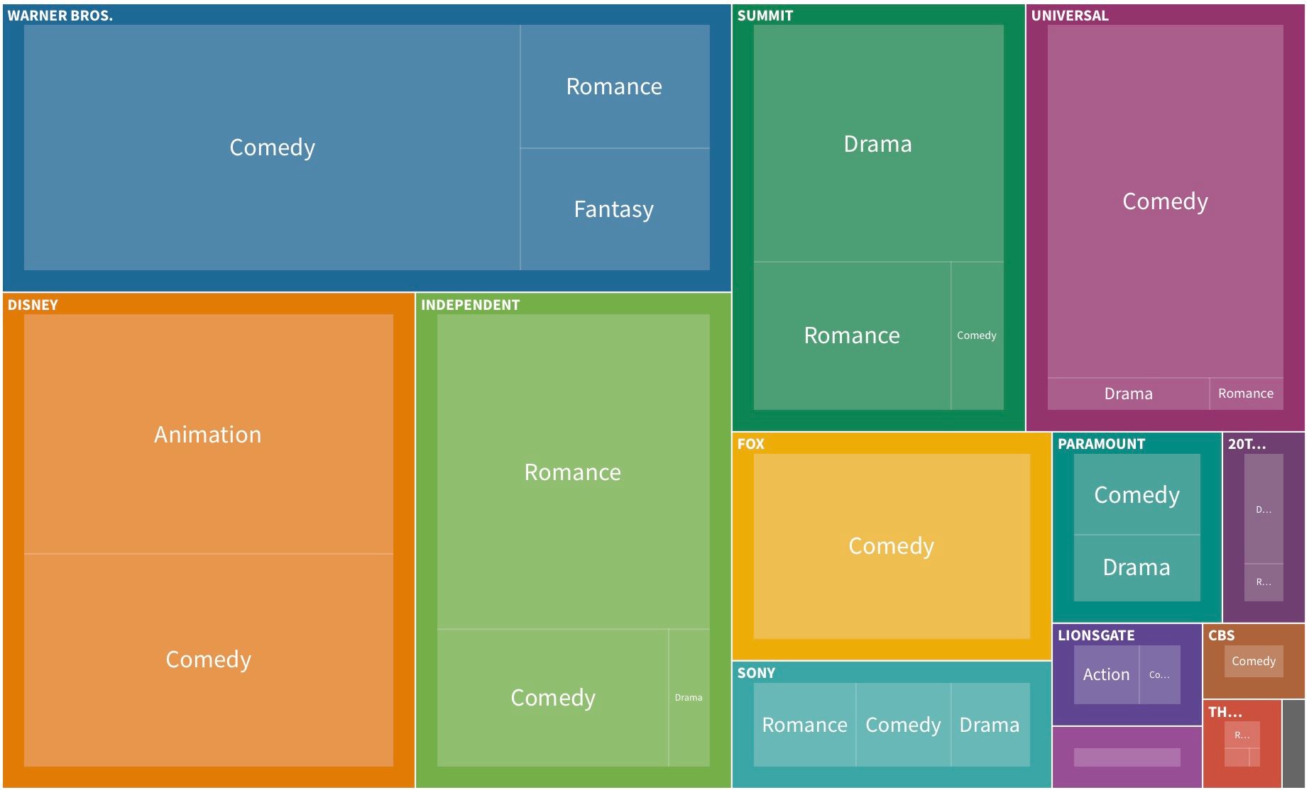
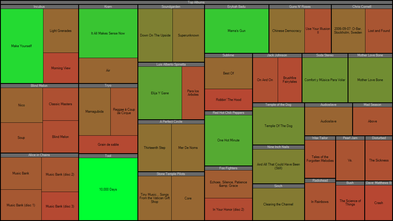
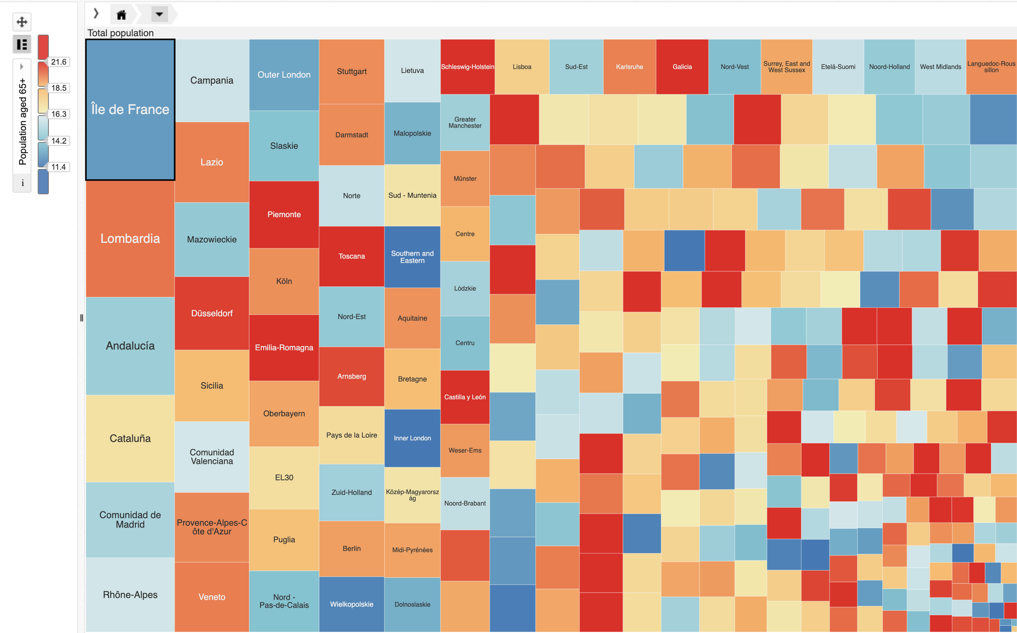
3 Example of "good" treemaps
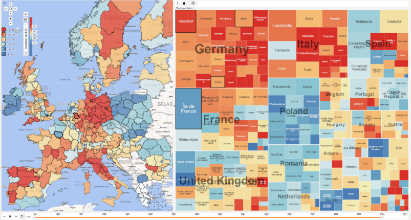
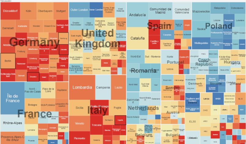
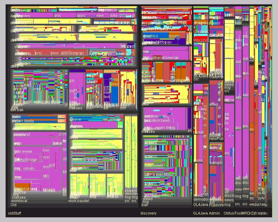
3 Examples of "bad" treemaps
Source: 1. https://www.nngroup.com/articles/treemaps/
2. https://ncva.itn.liu.se/?l=en
3. https://ncva.itn.liu.se/education-geovisual-analytics/treemap?l=en