Title: Gender Discount in art world
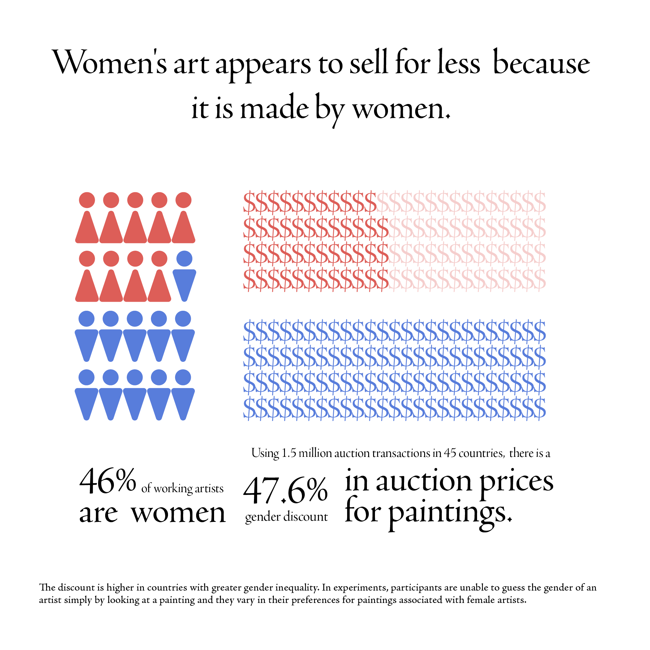
The graph shows that there is an almost equal gender distribution in working artists, but women artists experience a reduction of 47.6% of works' price in auction compared to men artists.
The data here first shows the gender distribution is almost equal in working artists, and then shows the massive price gap between women and men artists in auction.The data reflects even when the representation is equal, the bias exists in other forms, sometimes the most critical factors (eg. prices for their works).
Source: Is Gender in the Eye of the Beholder? Identifying Cultural Attitudes with Art Auction Prices & Get the facts about women in the arts
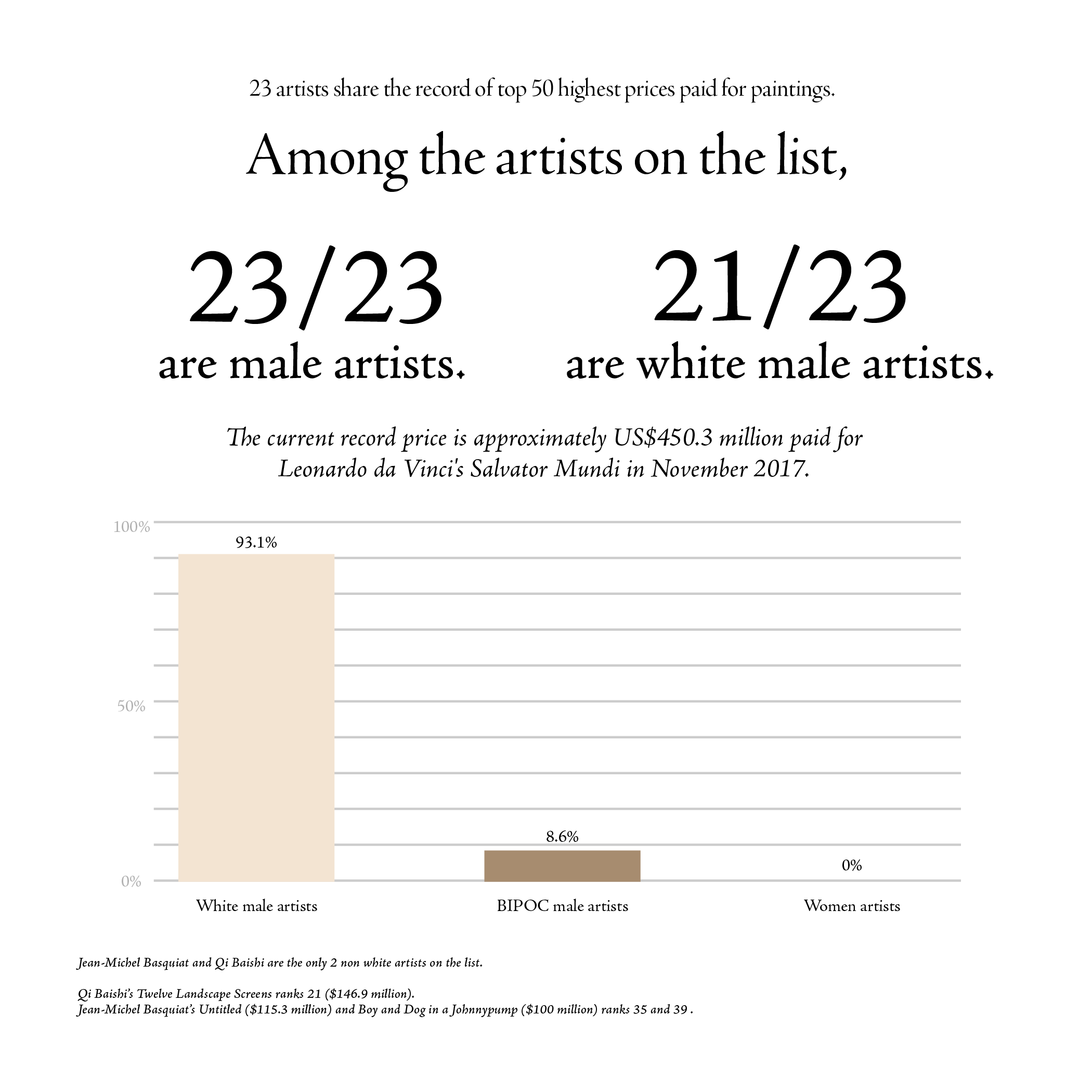
Title: The white domination in most expensive paintings sold
The graph shows the artists' gender and racial distribution within the list of 50 most expensive paintings sold.
The graph first shows the stark comparison between the number of white male artists and BIPOC male artists. The graph further shows the lack of women artists, with 0% representation in the graph. It represents the lack of artist diversity in the most expensive paintings sold.
Source:List of most expensive paintings
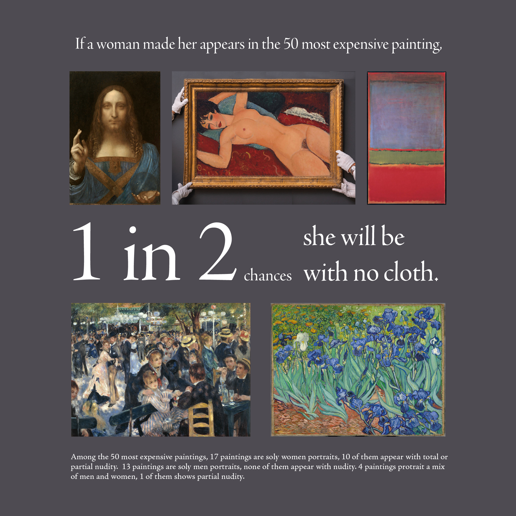
Title: How we see women in most expensive paintings sold
The graph shows the percentage of female nudity in paintings include figures.
The graph first shows that 50% of women portrait in the top 50 most expensive paintings are rendered with female nudity. The graph also shows when a group of people or only men are portrait, they would be clothed. It shows that when women are the only focus in the work, the chances of her being depicted as sexual object for the pleasure of male gaze are extremely high.