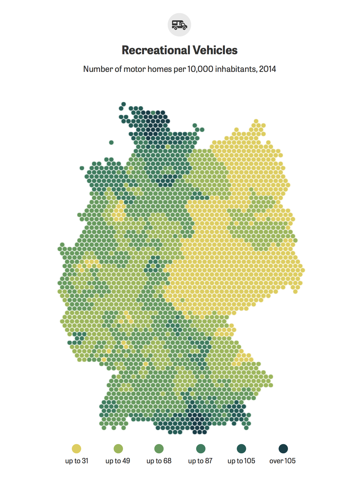
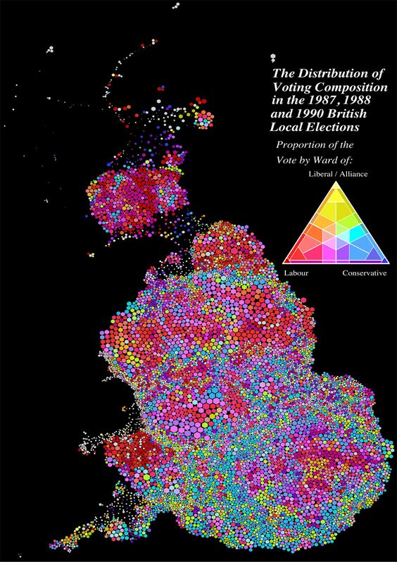
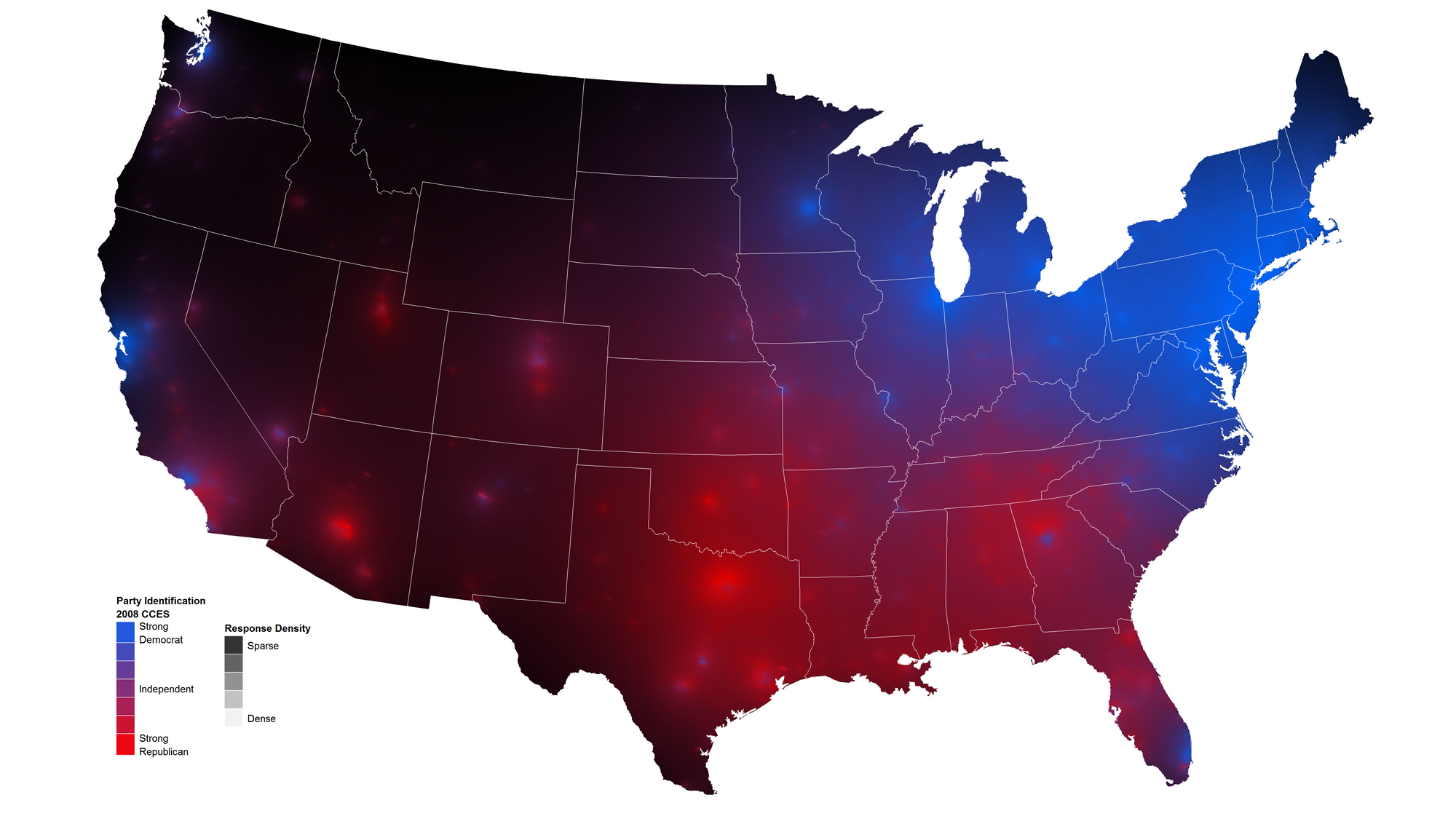
Physical Maps
Visual objects such as bars and lines do not translate well on maps. While easily understandable set alone, when transferred to geographical locations, there are simply too small and two many sections to visibly distinguish data in such a manner.
For physical maps, the best way to display quantitative information is to vary the color intensity or size, or both. As long as a clear legend key is provided, the range of values is flexible in that it can various data such as percentage of population or even aggregate income.
In all physical maps, the x and y axis represent latitude and longitude of the earth, as each location represents a specific geographical area.
More specifically, a choropleth map is a type of physical map that uses heat mapping in order to show distinct geographical areas or regions that are colored in relation to a numeric value.
While useful to understand how territory lines can affect variables, the disadvantage is that larger territories tend to have a bigger weight on the map visual, creating an inherent bias.
Your variables need to be normalized, as raw numbers cannot be compared between regions of distinct size or population. The goal of normalization is to minimize distortions in the differences in the range of values but also to convert the dataset to a common scale. A clear legend must be provided. In choosing a continuous color palette, one must be careful to pick specific hues that do not blur into one tone, making the data variation unclear and hard to distinguish. Most frequently, there is a sequential color ramp between value and color.
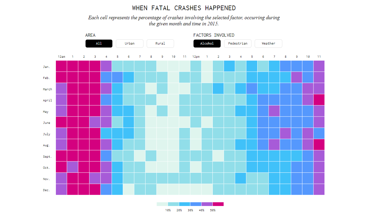
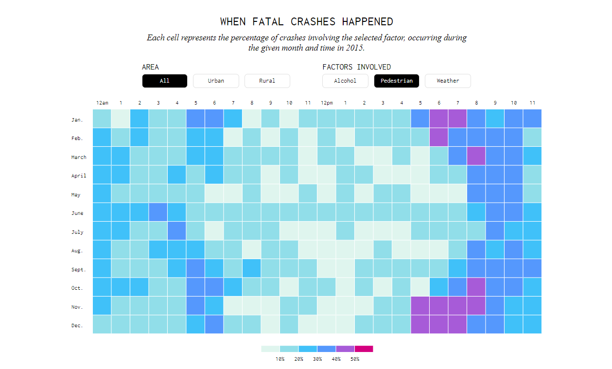
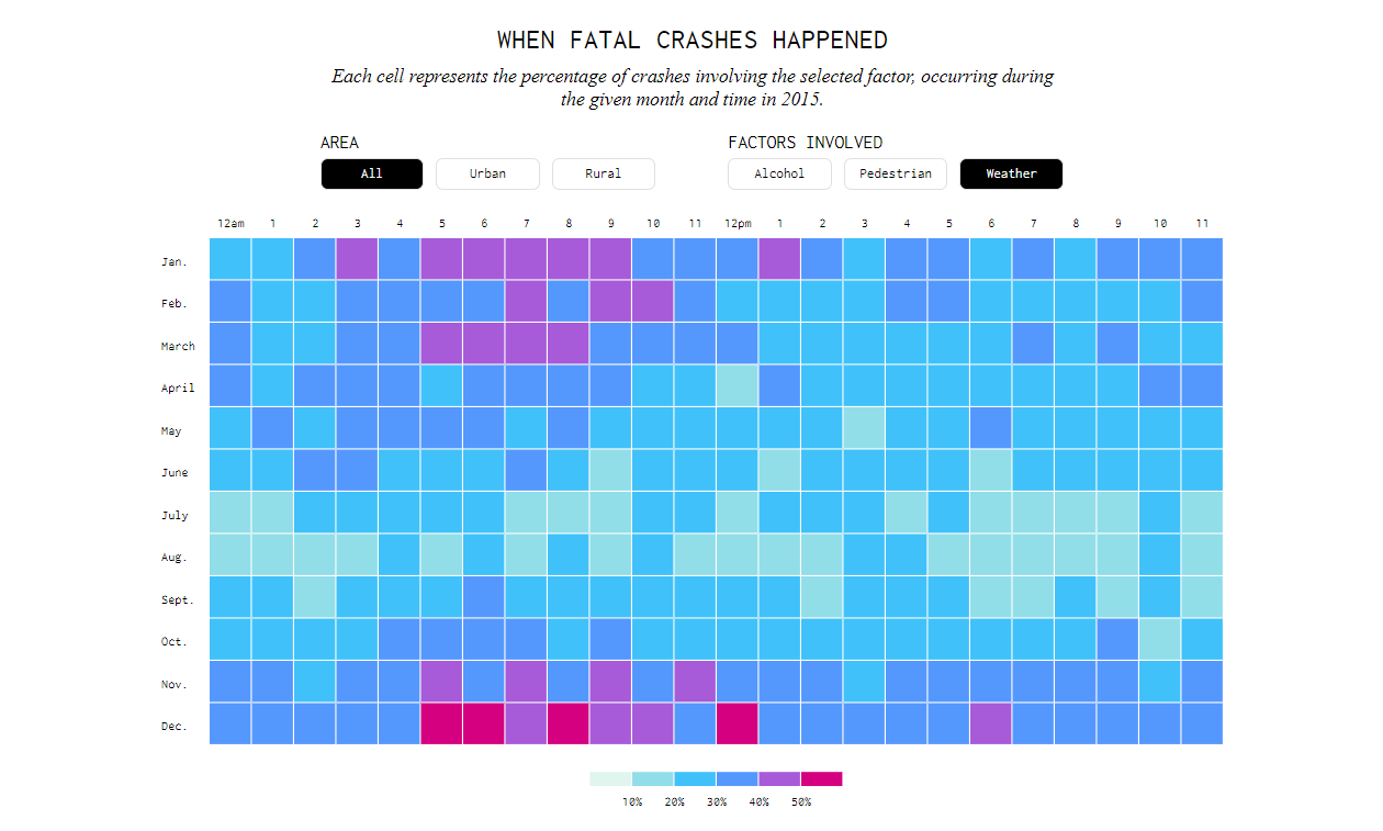
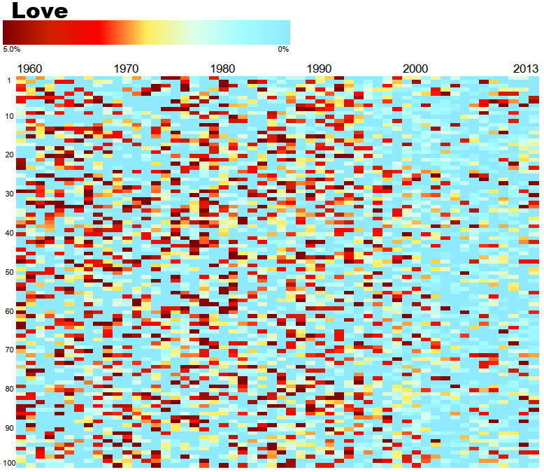
Heat maps
While physical maps can fall under the categorization of heat maps, heat maps are not restricted to only physical locations. A heat map uses colors to create a graphical representation of data where a matrix is used to organize individual values.
The most standard heat map has two axis variables that separate the colored squares onto a grid. The axis are divided into ranges, and each cell color indicates the value of the main variable as defined by a gradient legend that depicts the data range.
The variables plotted can take on both categorical or numeric values, and as a result the coloring of cells can take on all sorts of metrics, such as the frequency of a specific item, summary statistics, or even based on non-numeric values such as qualitative generalization of low, medium, and high.
Heatmaps are useful to display hierarchical clustering as it displays a general view of numerical data. Data must be normalized as a data set with too many variation creates even more individual hues, complicating the pre-existing issue with the inability to accurately tell the difference between color shades. Many times the exact value of each cell is still labeled with a number as it is hard to envision a color hue to a distinct value.
Heatmaps can also be used to show changes in data through the passing of time. For example, a heatmap could show the temperature changes in a year across multiple cities.