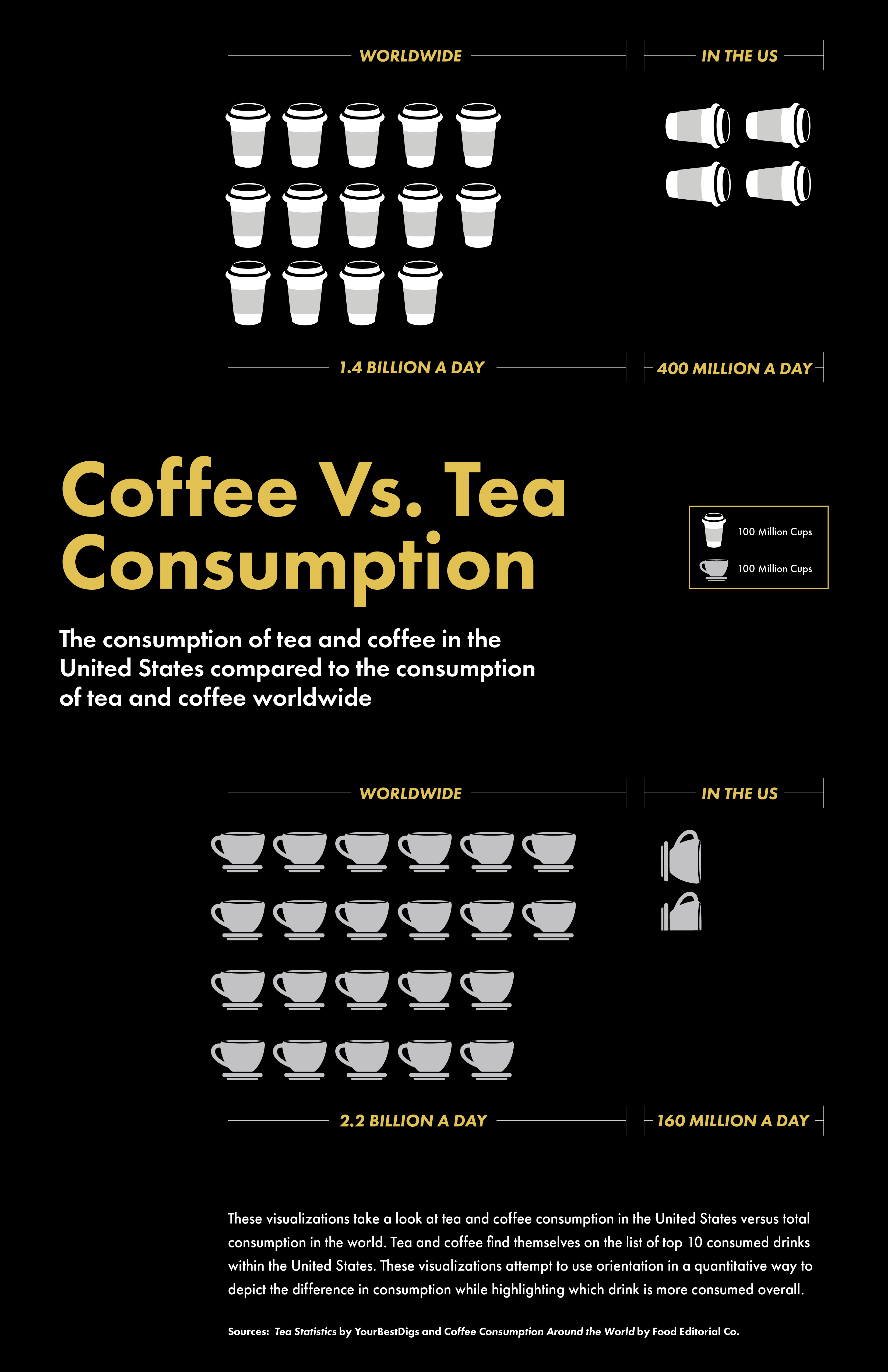
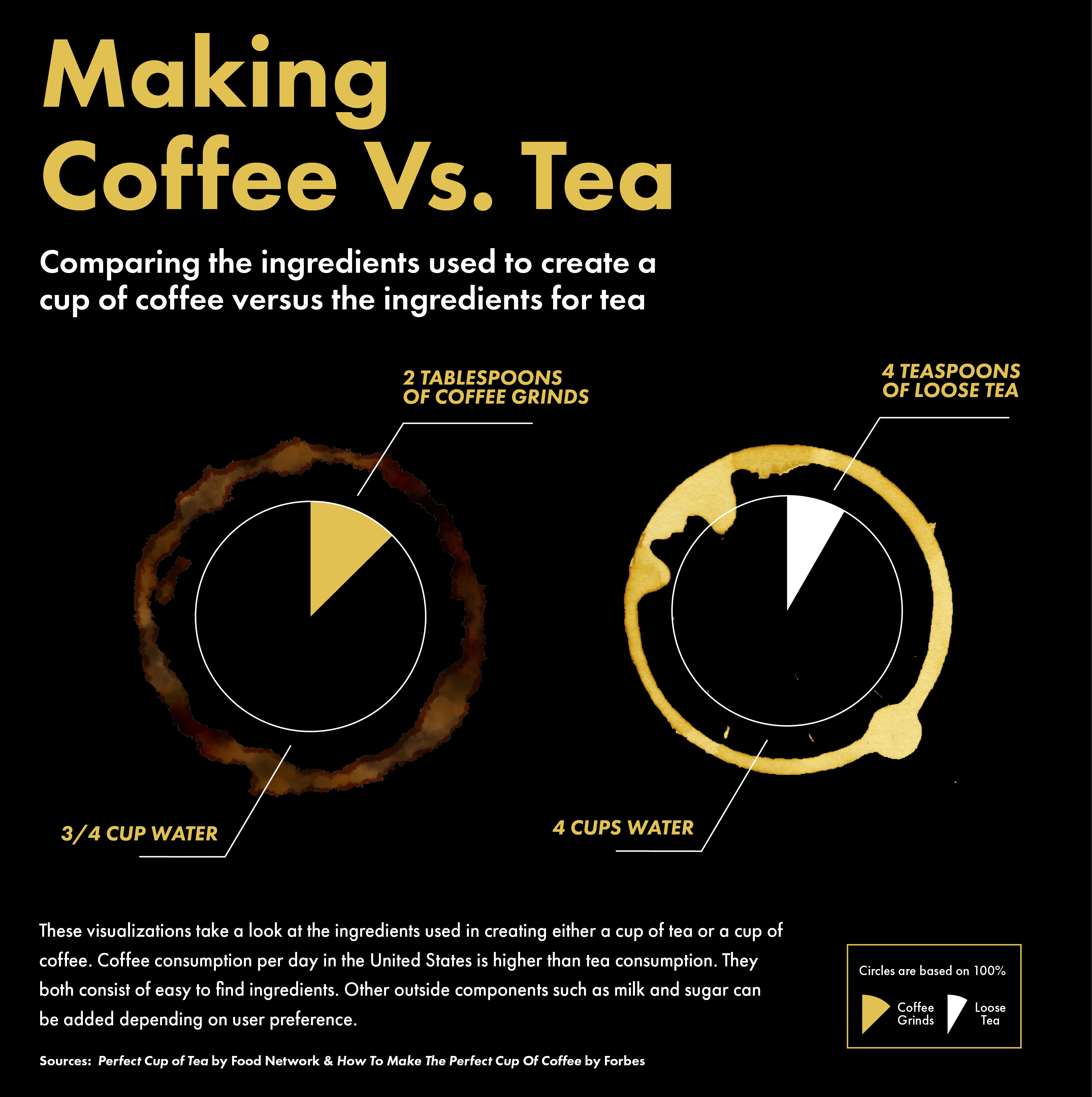
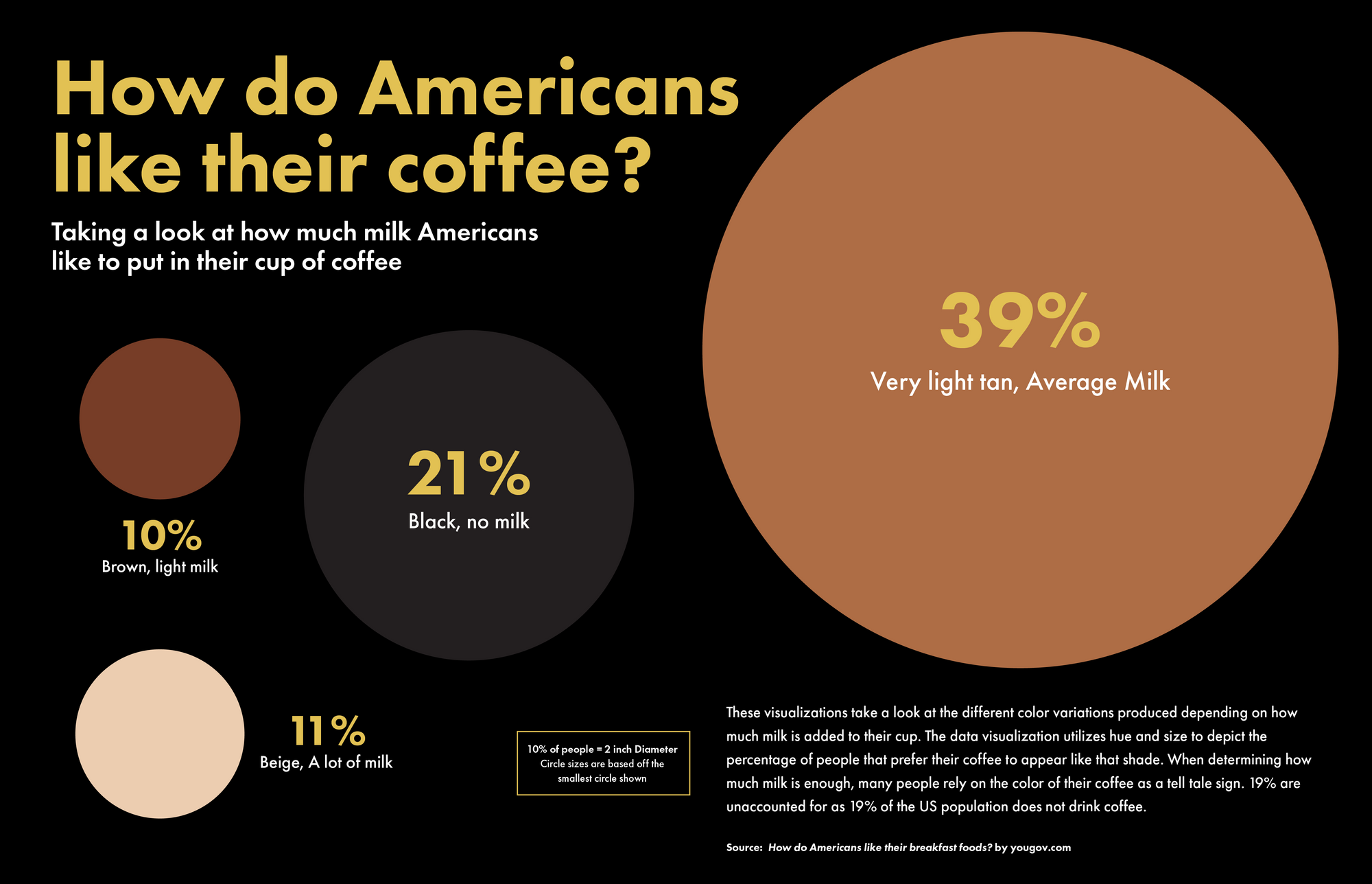
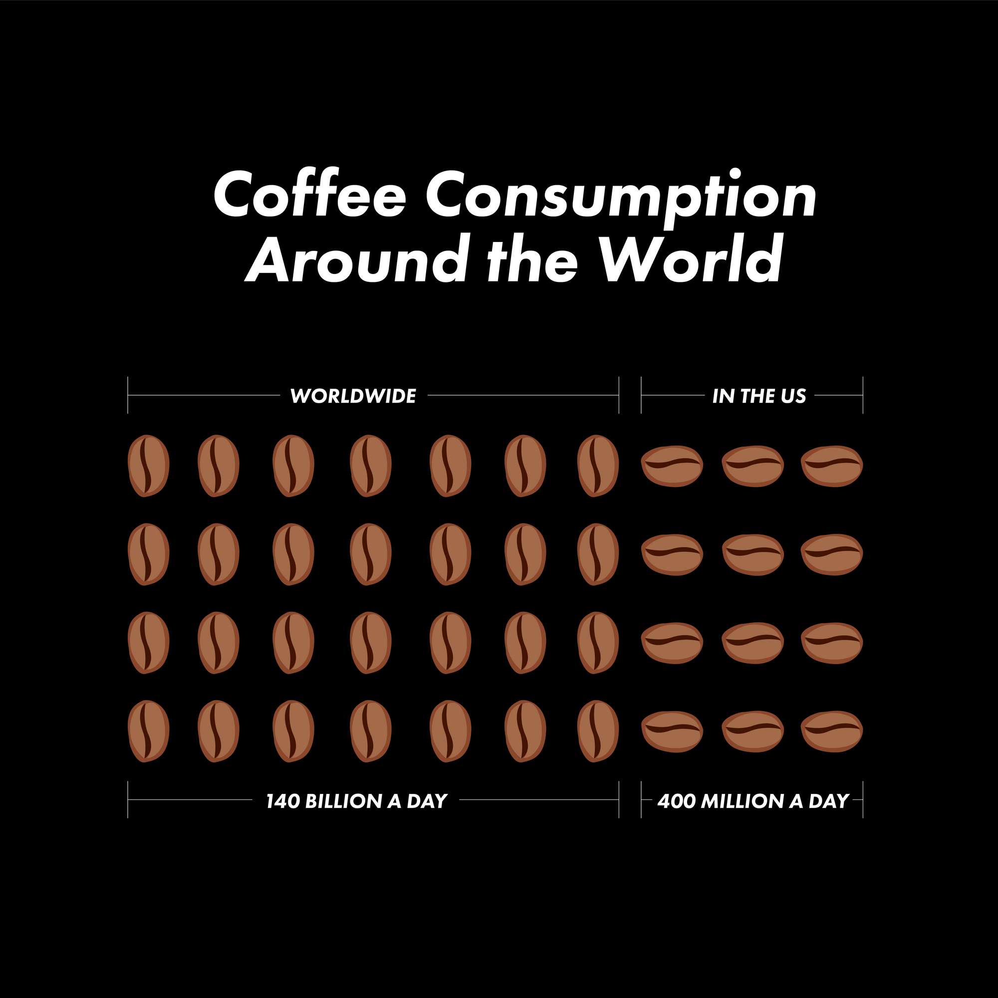
This visualization depicts daily coffee consumption versus daily tea consumption in the United States as seen in comparison with cups of tea and coffee consumed worldwide in a day. Data for coffee consumption came from Food Editorial Co. Data for tea consumption came from YourBestDigs. These visualization attempt to utilize orientation in a quantitative way to depict the difference in consumption while highlighting which drink is more consumed overall.This visualization depicts the ingredients used to make coffee versus the ingredients used to make tea. The area blocked out with color depicts the amount of either coffee grinds or loose tea needed to create a cup of either coffee or tea. To figure out the size of the area I first found how many teaspoons or tablespoons were in a cup. I then used that number to find out what percentage of the ingredient makes up a cup. Using this information I was then able to figure out what that percentage was out of 360 in order to map the correct angle. Therefore, the areas shown depict the percentage of coffee grinds or loose tea used to create a cup of coffee as seen in relation to the amount of water also needed. The recipes I referred to for measurements can be found here: Coffee, TeaThis visualization depicts how Americans prefer their coffee. Using scale, I am able to depict the percentage of people who prefer that way. - The circle's scaling is based off of the smallest circle which in this case means that every 2 inches in diameter adds on an extra 10%. The information portrayed in this graph is based off of data from YouGov.This is the first iteration from our 7 Numbers assignment.Show Comments