Describe your chosen visualization type in terms of the kinds of values it represents (e.g., fractions, integers, percentages, etc.) and the sorts of comparisons it enables or discourages.
A line graph uses lines to connect data points that show quantitative values over a specified period (these are almost always integers and whole numbers). Line graphs make use of two main axes: the "x" (horizontal) axis and the "y" (vertical) axis. The "x" axis depicts a continuous progression while the "y" axis reports values for a metric of interest across the progression of the "x" axis.
The x-axis requires a value that has a regular interval of measurement - most commonly, this value is used to represent something temporary, usually generating an observation over time. The y-axis will be used to report the value of a second numeric variable for points that fall in each of the intervals defined by the x-axis variable.
Most commonly, line graphs are designed to be read from left to right with the lowest values appearing closest to the bottom left corner, while higher values appear closest to the top right corner.
Enables:
Line graphs are best used to emphasize changes in values for one variable (plotted on the "y" vertical axis) for continuous values of a second variable (plotted on the "x" horizontal axis). Therefore, line graphs place an emphasis on change which can be best observed through the slope of the line as the line moves either up or down on the graph. Line graphs encourage comparison over long or short periods of time. They can be used to compare changes over the same period of time for more than one group. Therefore, line graphs are useful in showing small changes that are difficult to measure with other types of graphs. Also, line graphs present a good impression of trends and changes over time.
Discourages:
However, line graphs can get easily cluttered which can make them confusing to read if too many lines are being established. Line graphs are most ideal for representing data made of total figures such as values of total rainfall in a month. Also, a wide range of data is challenging to plot over a line graph, and line graphs can only be used to show data over time. Line graphs also can pose misleading information if consistent scales aren't used on the axes. Lastly, line graphs are mostly made to use for whole numbers and integers, therefore, it is inconvenient if you have to plot fractions or decimal numbers.
Explain what types of calculations need to occur to go from the raw data to the ink/pixels in the resultant chart (for instance, do you need to add up all the values then plot them based on their proportion of the whole? or find the minimum and maximum value to establish the endpoints of an axis?)
Line graphs most commonly pull their data from a two-column table corresponding to y and x axes. Before you start plotting points, you must determine what variables will be used for your x and y axes. Once this is established you can then find what will be the minimum and maximum values that will be used to establish the endpoints of your axes. Then, pick x and y values from your two-column table and begin to plot accordingly. Once enough points are plotted, you will be able to determine the slope of the line created. The slope can be determined by using the formula below. The slope of the plotted line will determine the rate of change seen in y relative to x.

Explain the ‘mapping’ by which numerical/categorical/etc values are converted into positions, sizes, colors, textures, etc. If the chart is primarily about using size to show values (as in, say, a bar chart), can it still use other features such as color to communicate other pieces of information? How?
Using data from your spreadsheet, you can "map" points by moving horizontally to establish your x value and then moving vertically to establish the y value where x and y intersect. This will help in creating a point, viewed as (x,y). Points on a line graph are usually visually demonstrated by use of a filled in circle. These points, (x,y), will begin to reveal a pattern. Once you have your points "mapped" you can then use a line to connect the points. This, in turn, will create your final line graph.
Line graphs can make use of color, line weight, gradients, and line patterns (such as dashed lines) to differentiate between lines. You can also change the shape and fill of the points to create more differentiation between lines. A line graph can hold multiple sets of data, therefore, it is important to use varying colors, line weights, and line styles to differentiate between your subjects.
Search the web for examples of your chart type in use. Include 3 images demonstrating ‘good’ uses and 3 more with ‘bad’ uses of this visualization type. Add a caption to each image describing what makes it good or bad.
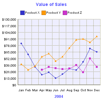
Bad Examples:

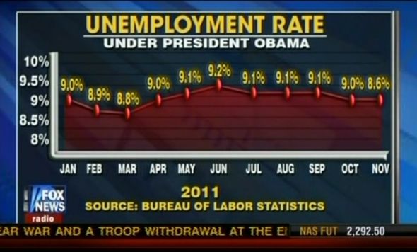
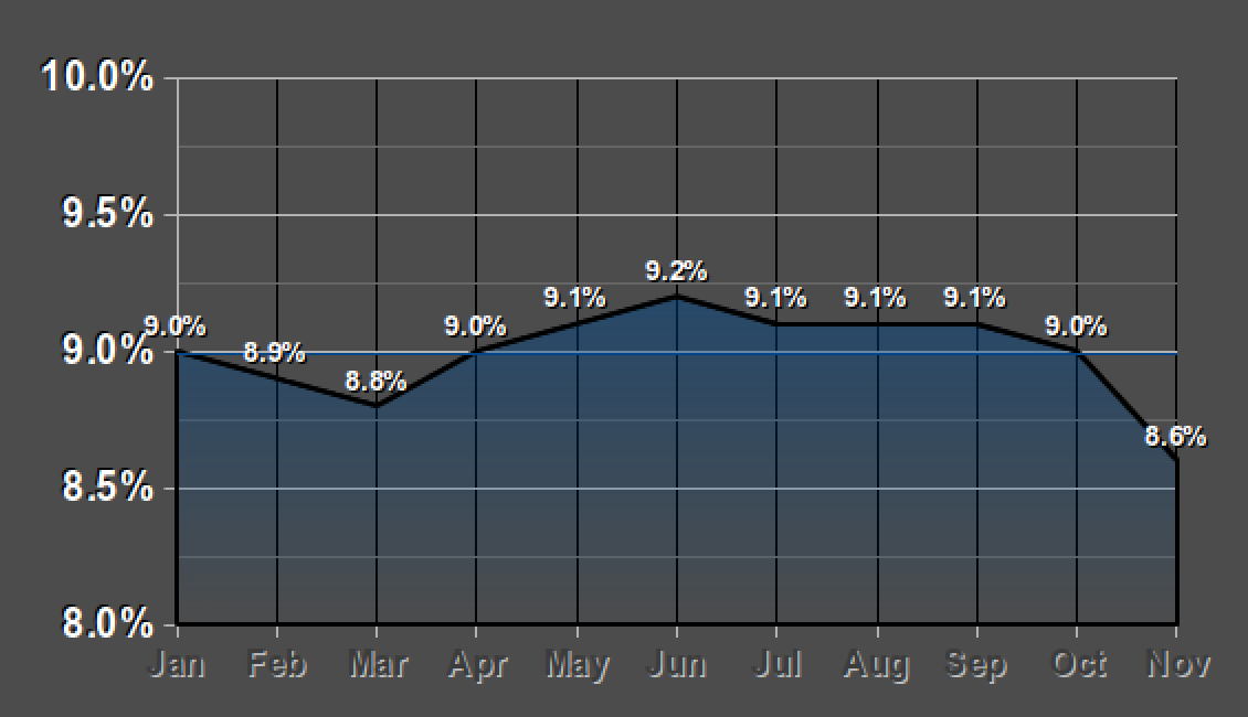
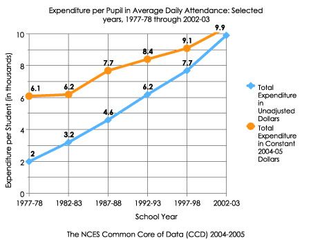
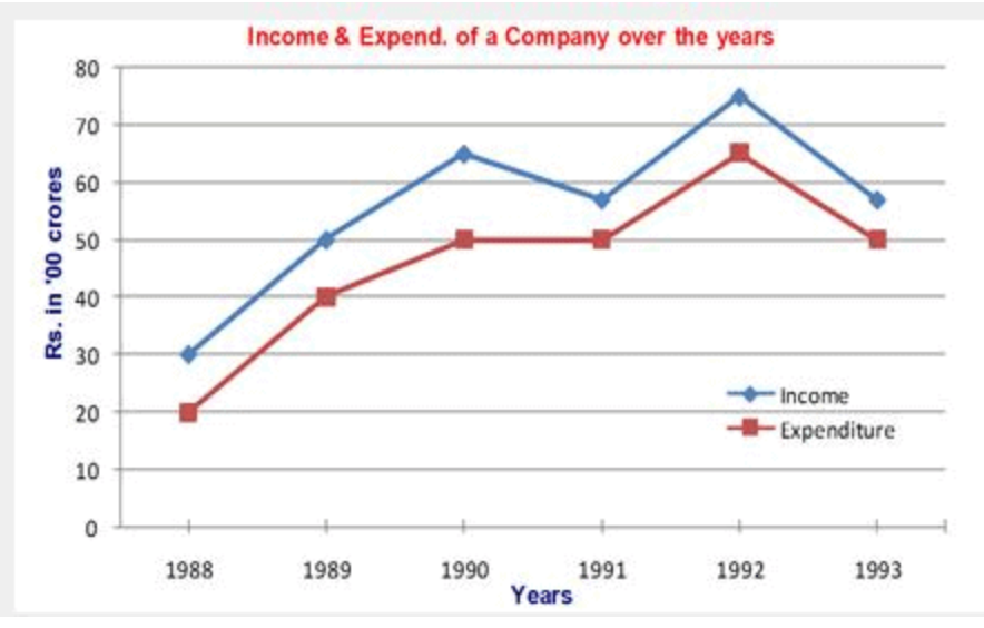
Good Examples: