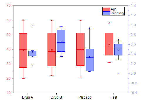
A boxplot, or a box-and-whisker-plot, is a graph that indicates the variability or the dispersion of the data, graphically depicting groups of numerical data through their quartiles. It can tell you about your outliers and what their values are. It can also tell you if your data is symmetrical, how tightly your data is grouped, and if and how your data is skewed.
The visualization of data through a boxplot is based on a five number summary (“minimum”, first quartile (Q1), median, third quartile (Q3), and “maximum”).
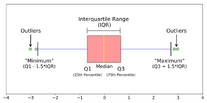
median (50th Percentile): the middle value of the dataset.
first quartile (Q1/25th Percentile): the middle number between the smallest number (not the “minimum”) and the median of the dataset.
third quartile (Q3/75th Percentile): the middle value between the median and the highest value (not the “maximum”) of the dataset.
interquartile range (IQR): 25th to the 75th percentile.
whiskers: the two lines outside the box that extend to the highest and lowest observations
outlier: a data point that lies outside the overall pattern in a distribution.(below minimum and /or above maximum)
“maximum”: Q3 + 1.5*IQR
“minimum”: Q1 -1.5*IQR
In a box plot, we draw a box from the first quartile to the third quartile. A vertical line goes through the box at the median. The whiskers go from each quartile to the minimum or maximum.
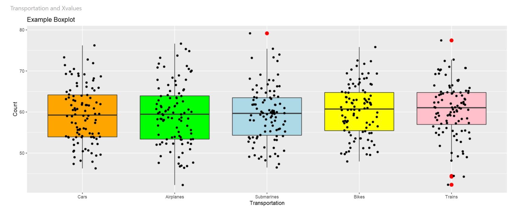
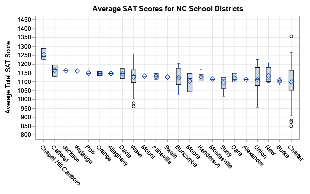
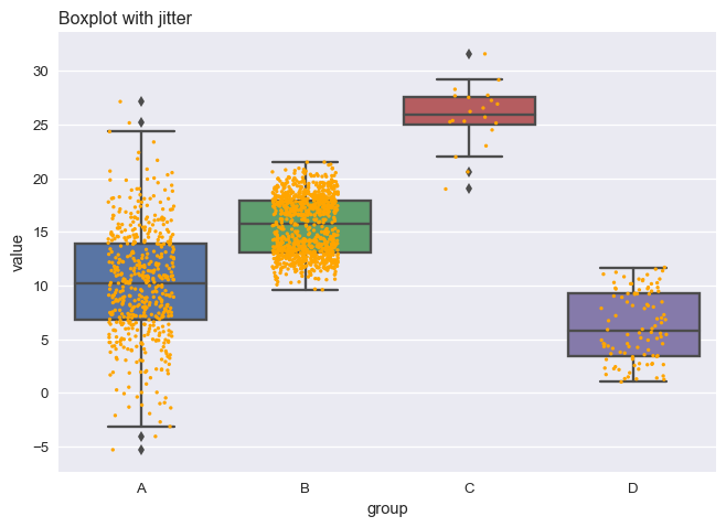
In addition to the traditional square box plots, box plots in other shapes (eg. violin plots, beans plots, notched box plots) exist to answer different needs. Sometimes an organically shaped box plot is more effective in showing the range and tendency of the data. Adding colors or points (called jitters) representing each data are also common.
Good examples:
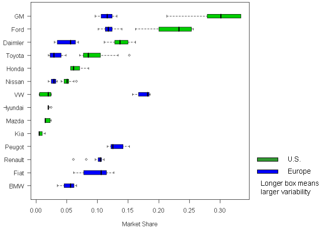
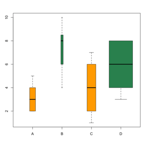
Bad examples: