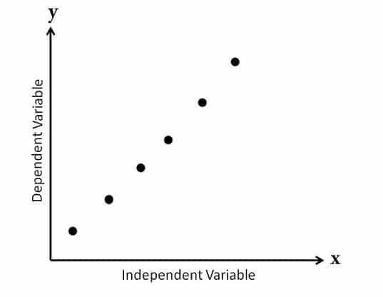
Scatter plots use points of dots that represent two different numerical variables in a 2d chart, but can be graphed in a 3d plain as well. The first variable is indepentend while the second value is dependant on the first. Scatter plots allow one to observe the correlation between the variables.
Scatter Plot Types:
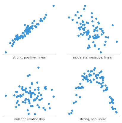
•Scatter Diagrams with no correlation: Here the points appear randomly dispeared making it hard to draw a line through them to estimate the average

•Scatter Diagrams with Moderate Correlation: Here the points are more clustered together making it easier to detect and generalize a relationship between this data set.

•Scatter Diagram with Strong Correlation: Here the points are clearly clustered together with an apparent relationship between the points making for an easy estimate of the average.

Each of these correlation types is further catagorized by positive or negative correlations. These are decided by the slant of the average.
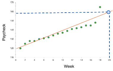
If the X value increases along with an increase in the Y value the correlation would be positive.
If the slant shows an increase in the X value and a decrease in the Y value, the correlation would turn out negative.

Scatter plots are very good for getting a general average out of the data sets as clusterings make it easy to see trends in the data, also allowing predictions to be made.
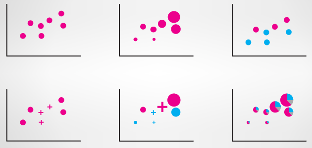
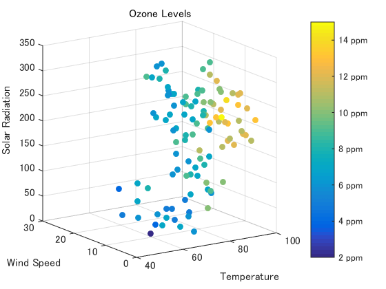
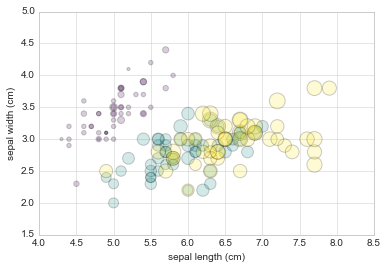
What makes scatter plots special is its ability to gather many additional variables while still providing understandable graphs. By providing a key one can alter shapes, the scale, hue, saturation, luminance, and or opacity to depict other relationships in the collected data
Pros:
Shows relationship between 2 main variables and additional sub-information. This allows for numerous data sets with matching axis to be overlayed onto eachother using different plotting point variations.
Non-linear graphing allows for a wider veiwer showing that correlation does not always imply causation.
Many variables can be plotted using different axis, hue, saturation, lightness, shapes, size, and transparencies.
Easy to identify averages using trend lines.
Cons:
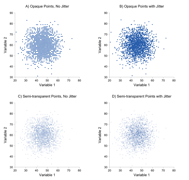
'Over plotting' makes it hard to decifer points when data is tightly clustered. Large data sets can be hard to visualize because of this.
Flat trend lines provide inconclusive results.
The graph does not provide precise data depictions as values are often rounded off.