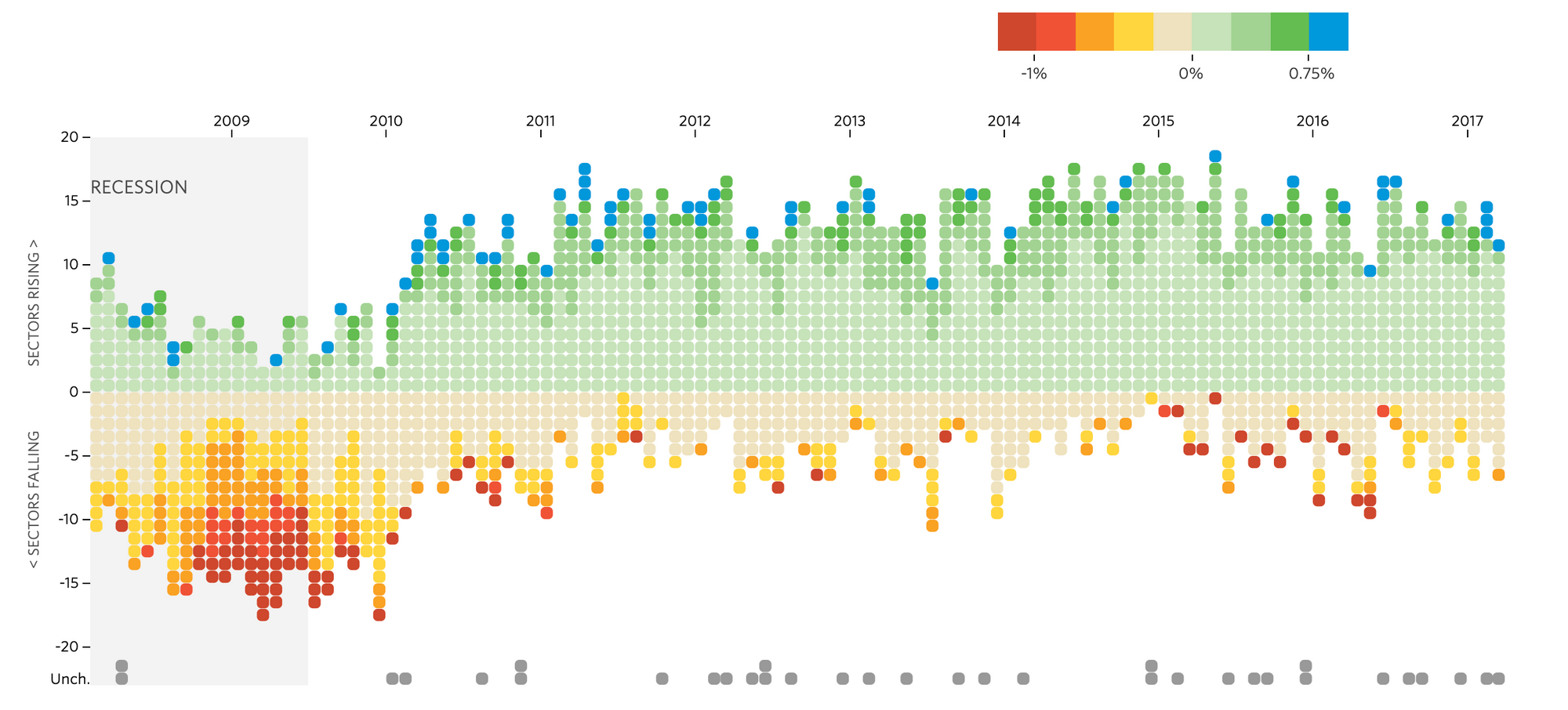
(Wall Street Journal) Winners and Losers: Job Gains and Losses Track the number of sectors gaining or losing jobs each month. Boxes are shaded based on percentage change from the previous month in each sector's payrolls.
Precise color palette that display the information clearly at the first glance. Arrangement of data points show the flow of rising and descending. The timeline is consistent and easy to compare data across the years.
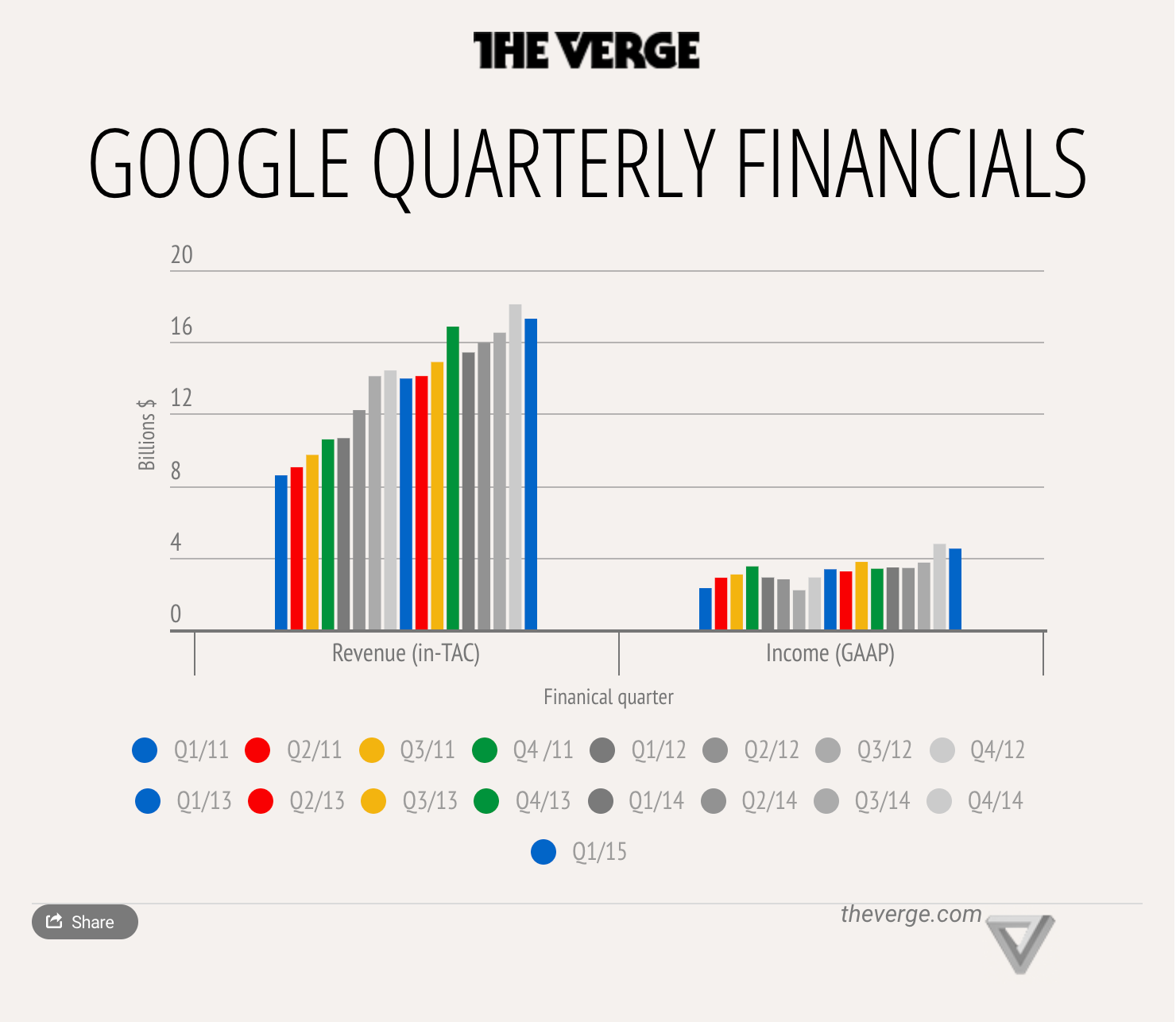
2. (The Verge) Google Quarterly Financials
Two groups of information grouped under the same bar graph, using colors to differentiate quarterly and year. Using bright and greyscale makes it easier to identify a certain quarter for comparison. However, some viewers may be confused due to repeating colors for each year.
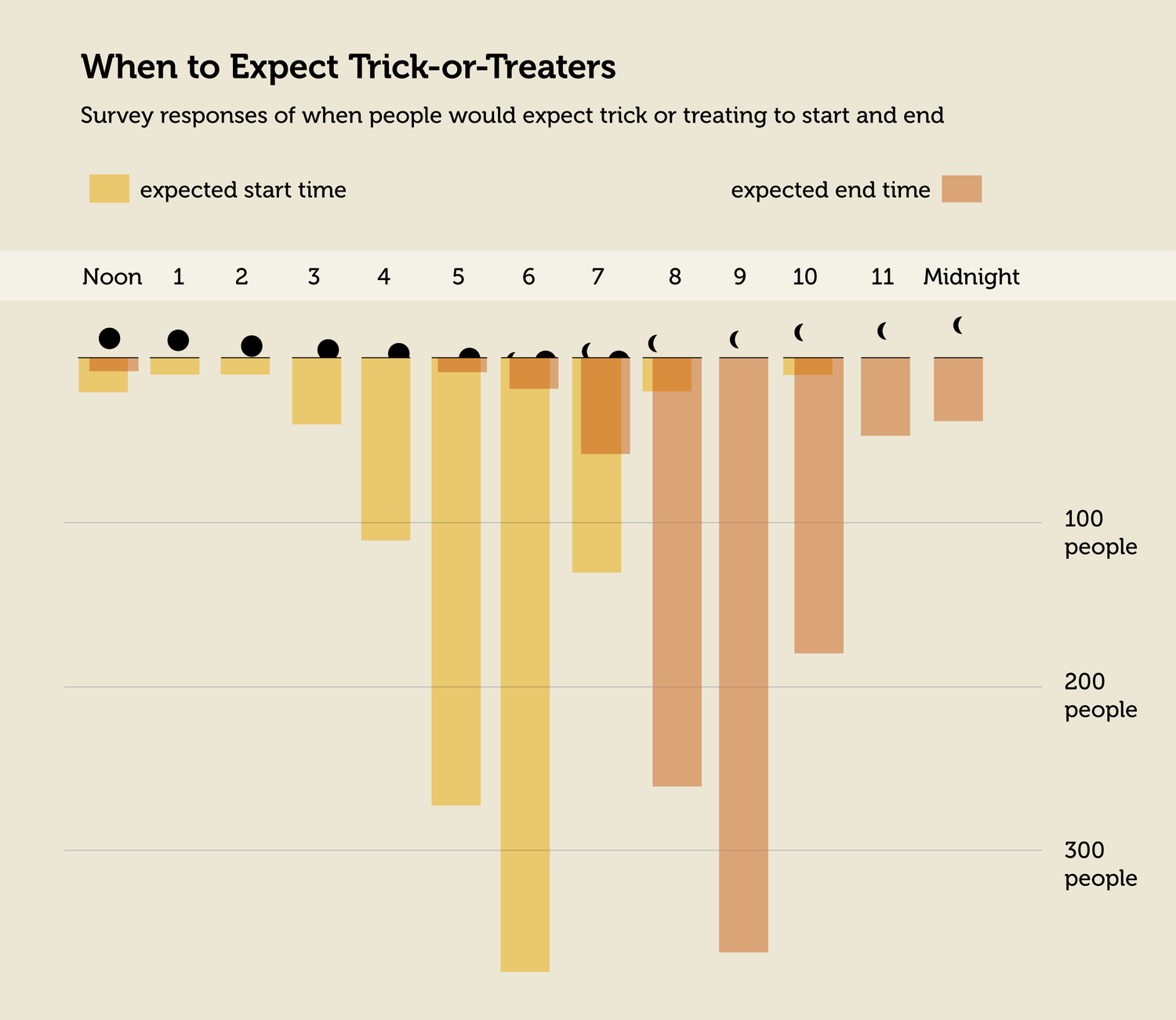
3. Expected Halloween Start and End Time
A simple and minimal design makes the viewer process the information very quickly. The method of slightly shifting overlapping colors is a good way to deal with repeating data. Small icons under each hour is a plus point for clarity and quality of design.
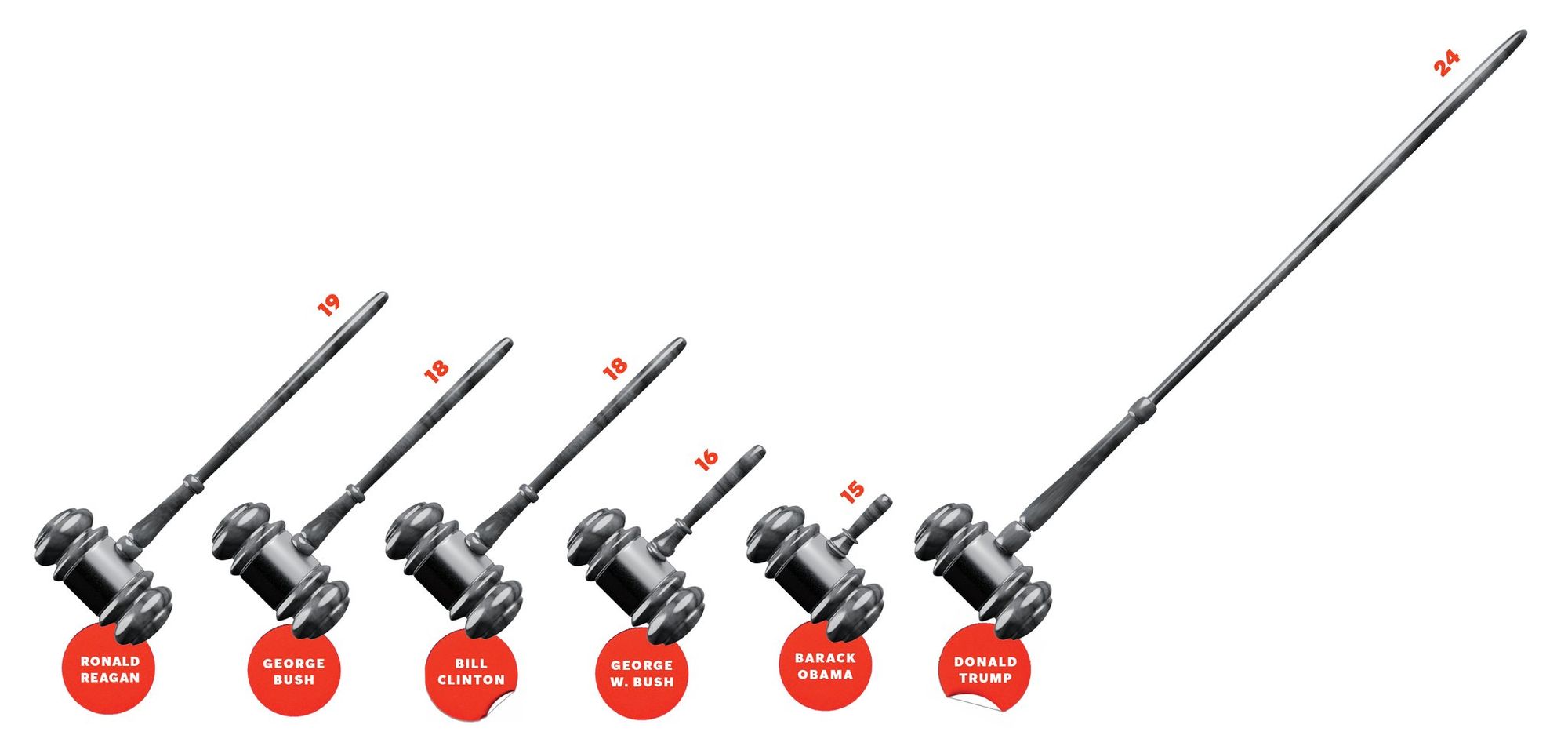
3 Bad Examples:
(The New York Times Magazine) Appellate Judgeships Confirmed During First Congressional Term
No baseline for Y axis. Exaggerating information for a biased perspective.
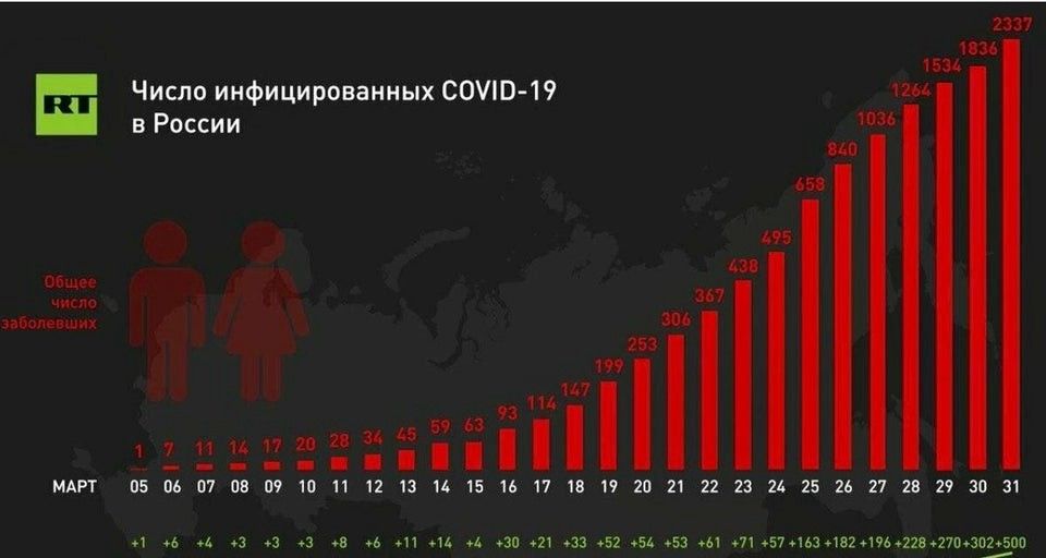
2. (Russia Today) The number of COVID-19 cases in Russia from March 5 to March 31
The graph is trying to "flatten the curve". When comparing March 25's 458 cases to March 27's 1036 cases, the proportions are out of ratio.
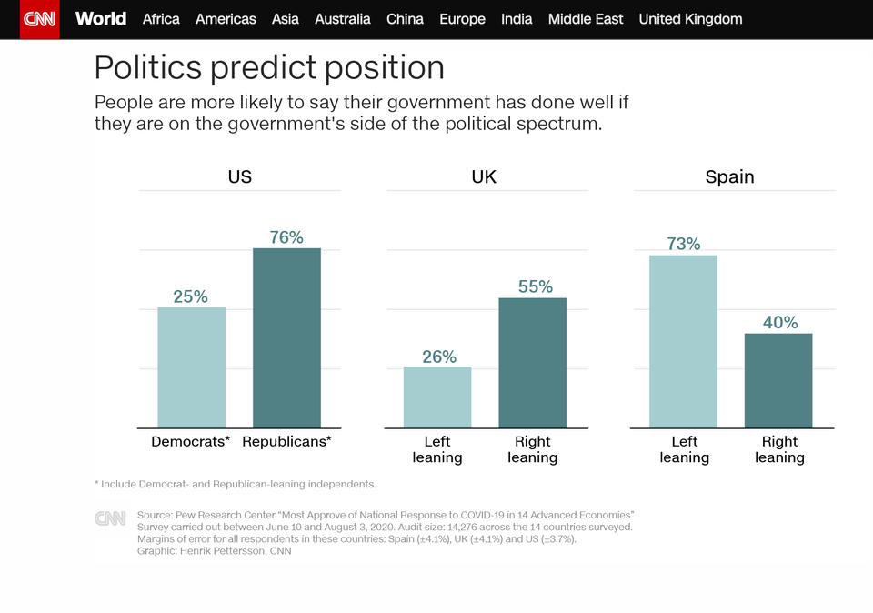
3. (CNN) Politics Prediction Position
Under US, the 76% of Republicans and 25% of Democrats are close to each other, even though the bar for Democrats should be 1/3 of Republicans. The bars across countries are very inconsistent.Show Comments